Cava Design System
UI, UX, Visual Design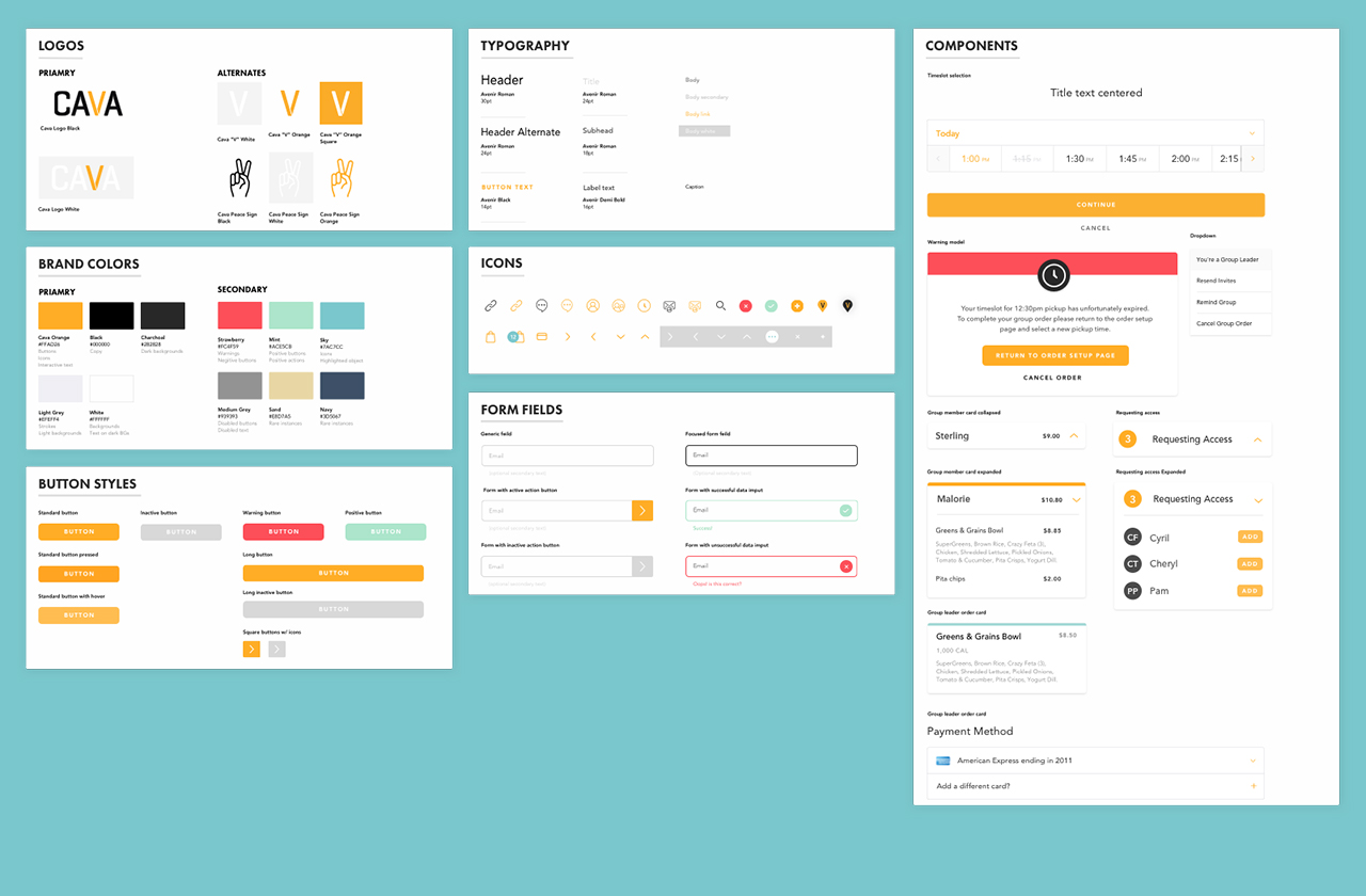
Designing Cava’s Design System from the Ground Up
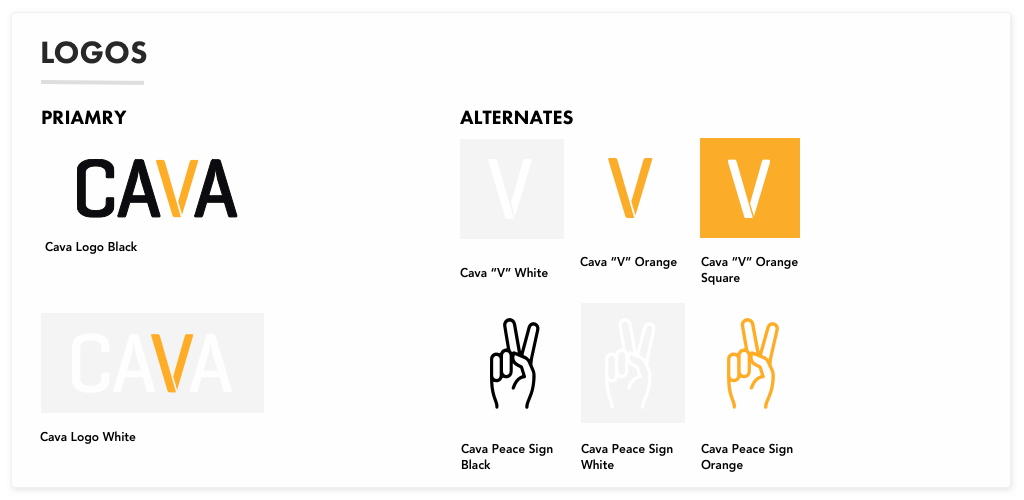
︎The establishment of Cava’s design system began as a project I took on prior to the major kickoff of the project Group Ordering, (which I write in further detail about here.) After the initial meeting about the Group Ordering project it was decided that the key to the project’s success was going to be through a lot of rapid prototyping and user testing. I was still new to the team and was still learning what product assets existed. The question I had was if there was a design system in place or at least a library of components that could be drawn from for prototyping to make that process more productive. There was not, and the only design files for the product were the original Sketch files from the product agency that had developed the original app. The idea I pitched to my team lead was if prototyping could be put on hold for two weeks so I could collect all the styles used across the design files we had, create nested symbols and in turn establish a foundation for the continued success of the product. They agreed that this was a good idea, so I started immediately.
The First Hurdles
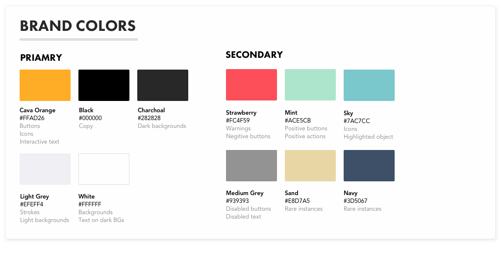
︎I started work on the Design System by auditing everything that was available in the Brand folder on the shared drive. The Brand team, which is separate from Product, had not finished their brand guidelines document yet so my first challenge pulling together an initial source of truth for the brand colors used across the product. Through this audit, I discovered that every logo that included the Cava Orange the hex value for it was off ever so slightly. Fixing the colors in all of the logo files and getting those into Sketch felt like the first little win. A big question that remained was where will this system live and how would it be maintained. It’s a question I think remains a challenge for nearly every one I’ve talked to about it.
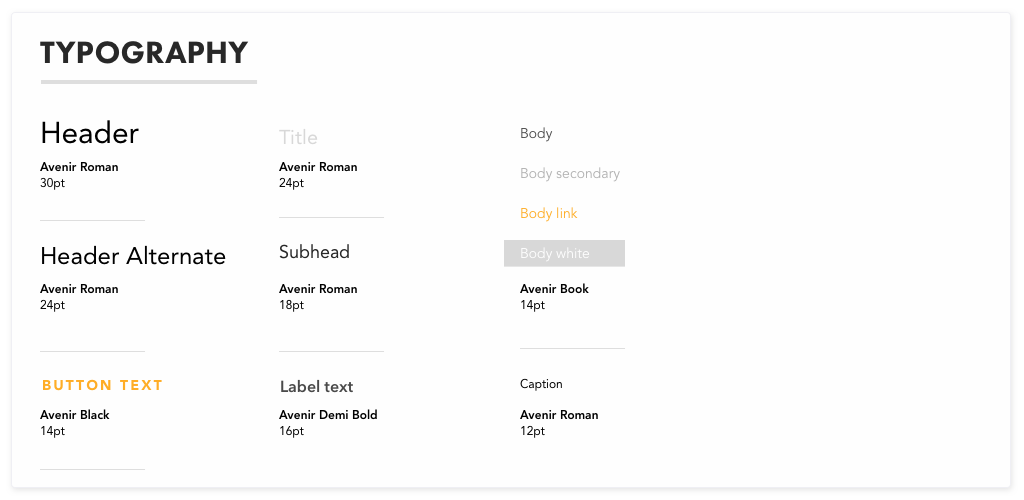
Buttons and Typography
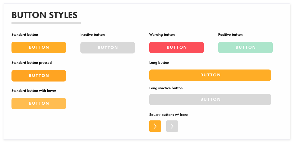
︎Having returned from Smashing Conference in NYC where I had seen Nathan Curti’s talk about designing buttons in design systems around this time, I was especially excited about getting to the stage where I could do this for Cava. One of the things I wanted to be sure to build into the system early on was being mindful of accessibility and using solid buttons vs. outlined buttons which don't provide enough contrast for users to see in some cases. Moreover, with all of the brand colors now in Sketch and saved as mix-ins, I had a lot of fun adapting colors used by the Brand Team and re contextualizing their use in interactive elements within the digital product including both the “warning” and “positive” button states.
Form Fields & Icons
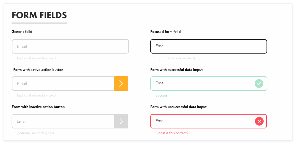
︎Forms
With branding and button styles in a good place I turned my attention to designing fields. This phase included some of the more complex nested symbols I had created for Cava as there were many instances in which a field was being used though out the product so flexibility was key. One of the decisions I made was building in a line of micro copy into the symbol to create more opportunities for stronger UX writing throughout the product.
Icons
Icons within the product were one of the bigger challenges I had to manage with this project. The original product agency had created a handful of custom icons in a line based style, however because all the original icons had been outlined and resized at some point it was nearly impossible to create a new icon and be able match the stroke width in whole pixels; moreover I felt the original icons had a lot of unnecessary complexity that made them look really busy at small sizes and made it that much harder to expand on the system replicate the original style consistently.
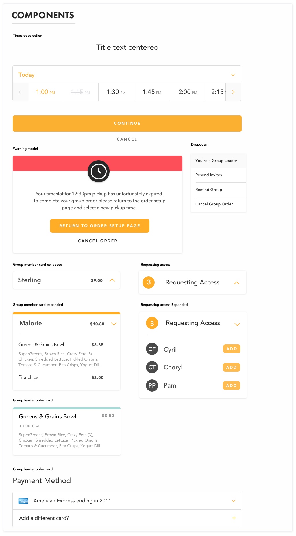
Assembling Components
︎
After the initial two weeks I worked to audit the existing design materials and build out the essential elements of the product to create a baseline for a scalable system, the benefit of my efforts were clear almost immediately once prototyping for the feature design project started as design was able to be dropped directly into place to design the flows rather than repeatedly coping and pasting from other documents. As new design was created, vetted and approved by the team these new patterns and components could be documented and added to this section helping the system continue to mature which was really exciting.Lessons Learned
︎
The system I pulled together in that short period was far from perfect but as I continued to design new pieces of the product, the system continued to take shape. A big jump happened when the team was able to add a new designer for me to collaborate with, and later a product manager to help with documentation, who, while we were interviewing they practically jumped for joy when she heard we had a design system in place. Two of my biggest lessons learned was helping me take a broader look at all the pieces that make up a digital product and taking the time to understand what they do, what their place is within the experience and how each piece can be used to help the customer meet their goals. The second lesson was finding ways to communicate the value of my design system to stakeholders. A reoccurring conversation with one stakeholder, in particular, revolved around a notion that projects have a start and an end vs. a design system that is a continually growing organism that requires maintenance and care to be successful but continues to mature over time. Trying to convey the concept that the concept that a design system is never “done” was one of my main challenges especially as the only designer on the team made it hard to feel like I was being supported. Despite this, I am proud of the work that I did and for defending the creation of something that is going to help the success of the product and team into the future.