TrackMaven Site Redesign
UI, Visual Design, Animation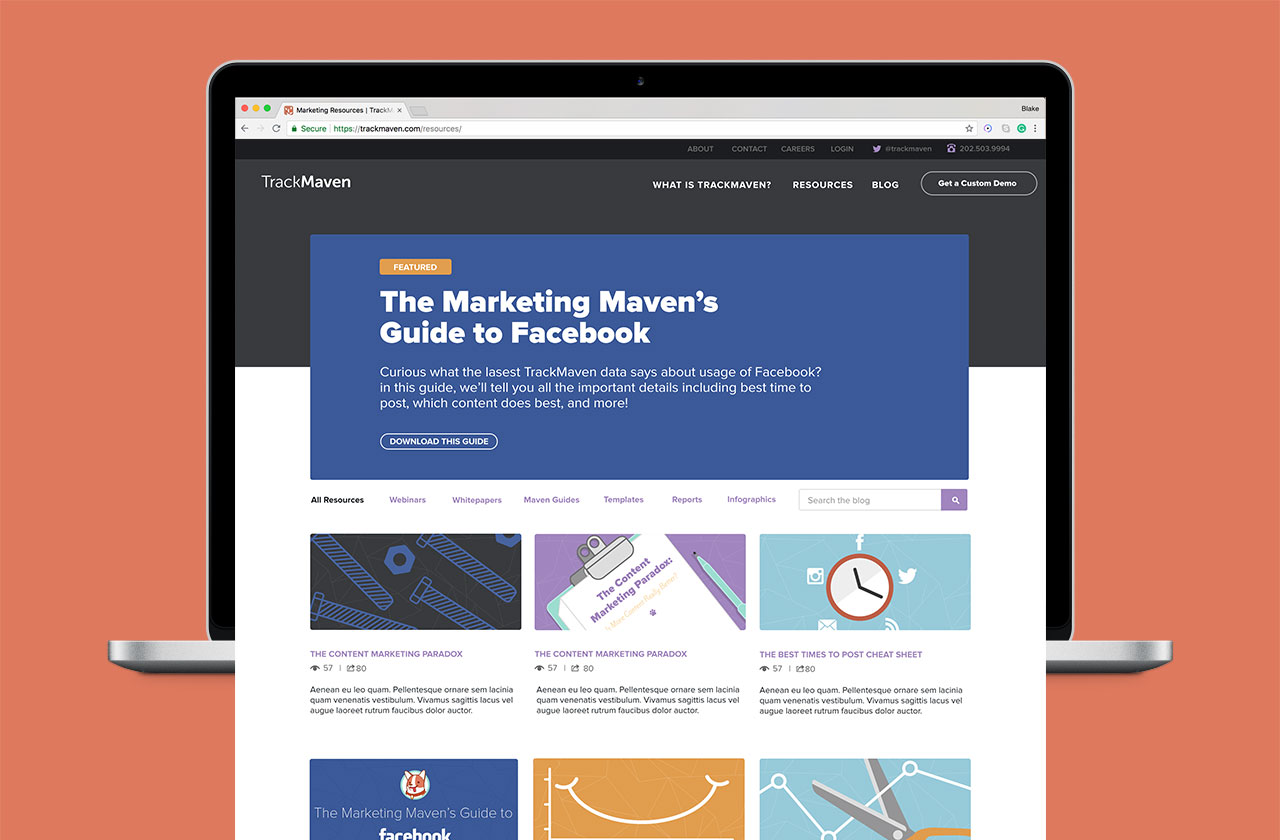
Background
Because the team was small, the pages that needed designing were divided between myself and the Design Lead with her taking on wireframes and product related pages and myself, taking on the visual design of all company culture and customer resource related pages.
Because the team was small, the pages that needed designing were divided between myself and the Design Lead with her taking on wireframes and product related pages and myself, taking on the visual design of all company culture and customer resource related pages.
Finding our Style
︎With TrackMaven in only it’s third year of being a company there was a lot of room with this redesign to create something unique and fresh that captured the energy of the young startup and help it continue to grow. Before designing any wireframes or layouts I concucted an audit of sites that the design team had been looking at for initial insporation and created documentaion around the various modules and layouts that we felt resonated with our brand. With this research as a baseline the design lead and I created style tiles to explore multiple highlevel visual directions to try to find ways to combine the friendly yet informative brand voice with illustration, typography and photography.


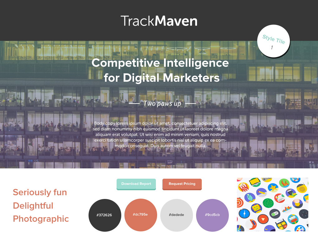

Style tiles exploring design directions for the new site.
Choosing a Direction
︎
From the explorations with the style tiles and meeting with key stakeholders including the CEO, my design lead began on the initial wireframes which after these were complete I would rejoin the project for us to divide and conquer on the template designs which went through several rounds of design before ultimately landing on what would later go into production.
The Resource Pages
︎Throughout the marketing team’s content calendar are several large marketing data research projects which played out as intensely cross-team collaboration exercises between the marketing, engineering and design teams as well as multiple smaller reports in between. The goal of this page was to create a platform for customers to connect with the research being conducted through these collaborations (many of which I had worked on) and to generate leads for the sales team through the content download page on the right that collects some information from the potential lead looking to download the content. With the download page itself, the challenge of the design was that we were intentionally adding friction, so we needed to keep data entry to only what was necessary to prevent potential customers from deciding that the download was not worth the effort.


Designing the Events Page
︎A big part of TrackMaven’s outbound marketing strategy was the creation of content that allowed the brand to connect directly with their target audience in a personal way. This strategy was approached through the regular hosting of webinars, conferences, and sponsoring events. Because each of these content types was an opportunity to attract a new lead it was incredibly important that the landing page for event content was clear while adding some playful elements such as the exaggerated event dates.

Team member profile page
The Team Page
︎TrackMaven as a company has always been about the people that work there and highlighting their unique contributions to the team. When redesigning the team pages, the idea was to use color to connect an individual to the team they were on while bringing increased usability to this section by improving the navigation. In an earlier version of the site, once a user had clicked into a team member‘s profile, there was not a way to return to the team landing page without hitting the back button. In my redesign of this page in addition to restructuring the layout and content, I redesigned the navigation to include a new button in between the “next” and “previous” buttons that would return the user to the team landing page. Ultimately, however, this particular design was not implemented in favor of a different layout.
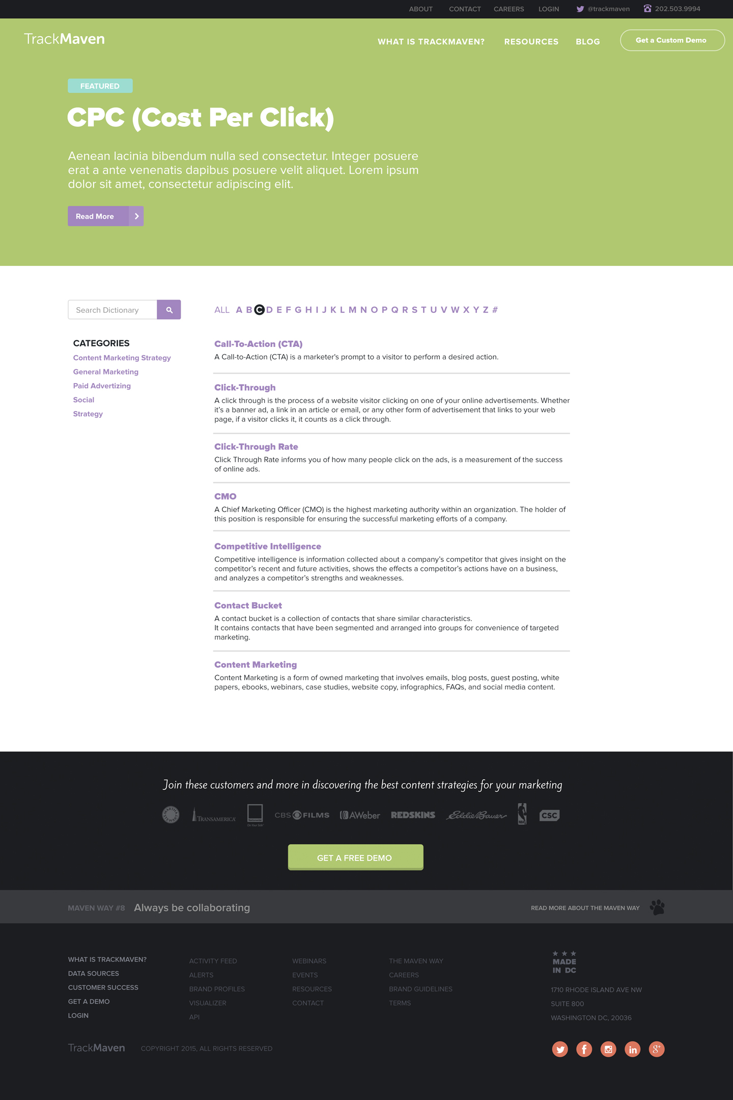
The Marketing Glossary
︎The Marketing Glossary was a sizable piece of content created in the earlier days of the company. Because part of the brand personality is about being a resource to help marketers do their jobs more effectively through being informed the glossary had to be redesigned to align with the new direction of the site this page was a helpful tool for the marketing team position themselves as thought leaders in their industry which just so happens also to be TrackMaven's target audience. The top area of the page to the left would highlight a featured term that the Marketing team wanted to highlight while adding an interface that would let users either search for a specific term or browse by category or select an alphabetical range. To the right, on the glossary term detail page, the structure of the page was designed to facilitate a comfortable reading experience and ways to either read the next or previous term or return to the glossary landing page.

Illustration
︎
In the years that I worked at TrackMaven, the brand was centered around the concept of approachability and friendliness through bright colors and playful illustration. With this redesign project, it was a big chance to think about how illustration could be used to leverage the startup’s unique brand voice and set the company apart from the competition.
Product feature illustration
︎
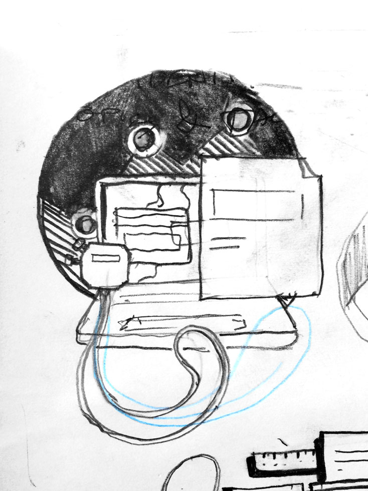
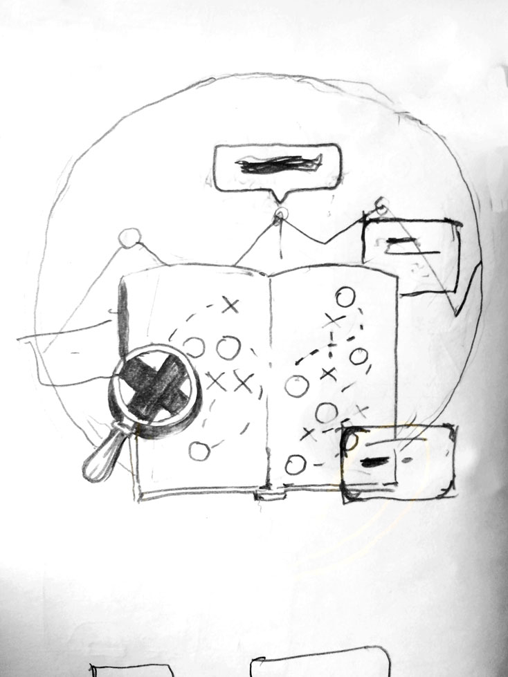
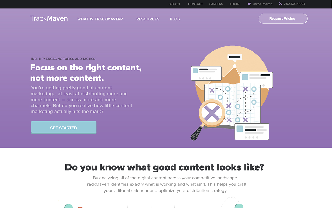
One of my most significant challenges was creating illustrations that visualized features within the product that turned abstract marketing concepts into something that would resonate with our customers. My process was to break down the words in the feature’s title to find visual parallels within them to create a layered illustration that connects back to the supporting text. Below is a breakdown of taking a sketch through the final implementation of the illustration for two features, “Benchmarking Content Performance” and “Identifying Topics and Tactics.” Although the illustrations were well executed, going into the project there were some unknowns around how they would finally be implemented in the design making them, in some cases hard to work into some layouts.


Company Values
︎
The intended use for these illustrations were for a page about company values where the visuals would be paired with corresponding text. The page ended up getting cut from the website redesign only to be resurrected again with a new vision where the company values would be illustrated with corgis. This idea was abandoned as well due to being very time-consuming regardless of how adorable the illustrations were.