AI/ML Design System & UX Enhancements
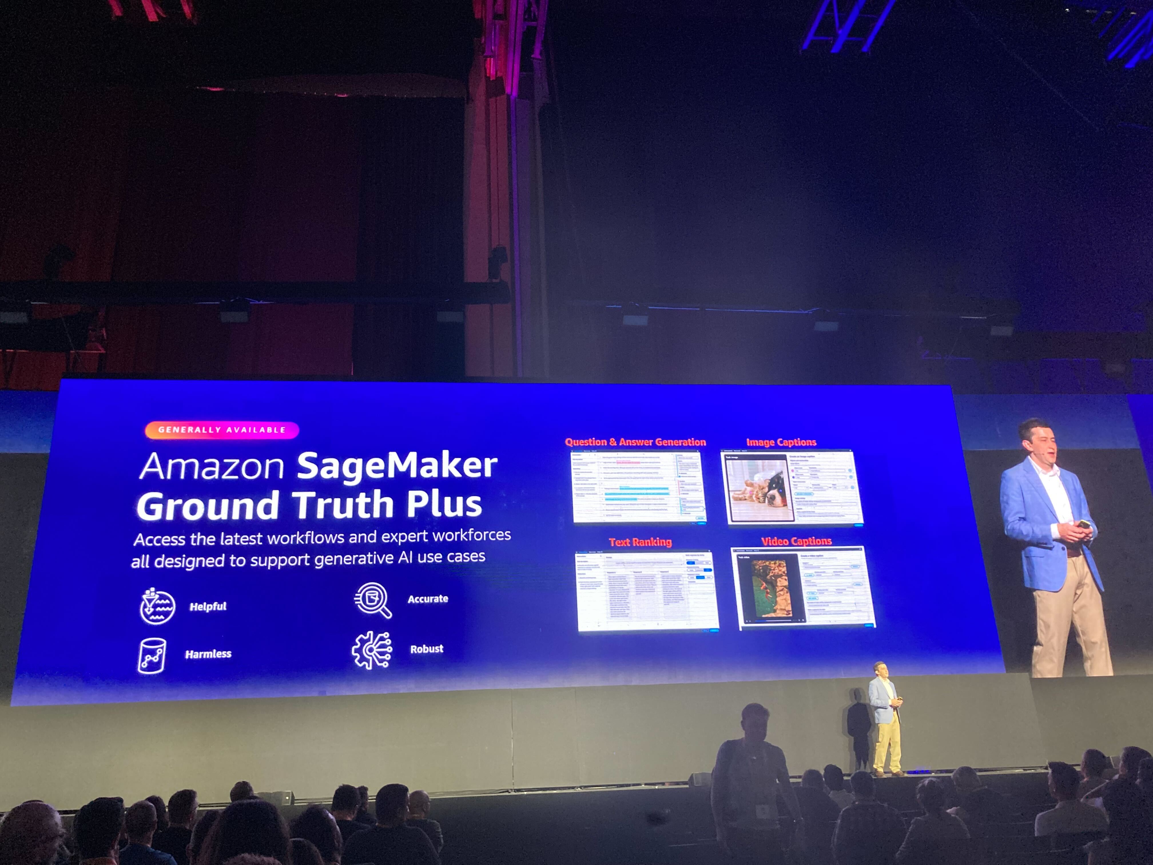
AWS Sagemaker Ground Truth Plus
Team:
Sr. Designer: Blake (me)
My client stakeholder/ design manager
Scope: 5 months
Sr. Designer: Blake (me)
My client stakeholder/ design manager
Scope: 5 months
Background
Provide design consulting support for the AWS AI/ML org, with a focus on annotation tooling.
Provide design consulting support for the AWS AI/ML org, with a focus on annotation tooling.
The challenge
A fast moving org with limited design support for product tooling which had all been built ad-hoc without any unified standards.
A fast moving org with limited design support for product tooling which had all been built ad-hoc without any unified standards.
Project goal
Establish a design system to allow AI/ML product designers to work more efficiently while improving
Establish a design system to allow AI/ML product designers to work more efficiently while improving
Limitations and gaps
As a suite of tools within AWS, the choice to leverage Cloudscape, an open-source design system managed by AWS was easy because using Cloudscape would allow the annotation tools to have a matching look and feel to other experiences within the AWS ecosystem, reinforcing customer trust.
However, I learned from exploring the current state that as a suite of productivity tools for annotation, the AI/ML library needed to support two essential modes by default so that designers in the org could build with these modes in their mocks.
- Dark mode
- Compact mode
First, the challenge was that Cloudscape was designed to support the AWS console experience, which by default uses a light palette with lots of whitespace. These design choices are at odds with the dense UI needed for complex annotation tooling.
Although both dark mode and compact mode were available in the code, neither are common scenarios for AWS console designers, so the Cloudscape design system team never prioritized support for them in Figma libraries. Mode specs are also rarely documented.
Identifying gaps
In addition to lack of mode support there were multiple components that Cloudscape did not have and would need to be designed from the ground up for the AI/ML component library. To understand what coverage we would get from Cloudscape out of the box I assembled a component inventory of AI/ML tooling use cases and compared my findings against existing cloudscape components. Out of the roughly 28 component types I found across the annotation tools that I looked at, only 17 could be covered by Cloudscape.
In addition to lack of mode support there were multiple components that Cloudscape did not have and would need to be designed from the ground up for the AI/ML component library. To understand what coverage we would get from Cloudscape out of the box I assembled a component inventory of AI/ML tooling use cases and compared my findings against existing cloudscape components. Out of the roughly 28 component types I found across the annotation tools that I looked at, only 17 could be covered by Cloudscape.
As another part of my gap analysis, I conducted a similar inventory of icons being used across the annotation tools, finding 54 different icons with only 22 matching icons available in Cloudscape. Later in the project I redrew many of these icons to match Cloudscape’s icon style.
Building the library
Early challenges
Based on the component needs I discovered in my inventory, I got started building out dark mode and compact versions of Cloudscape components. The core challenge I had was that in order to accomplish this I had to reverse engineer components, relying substantially on inspecting the code on implemented components scattered across demo pages.
The benefit of this level of component deep dive was uncovering gaps in the documentation as well as the start of a library that’s built closer to that of the live implementation of components.
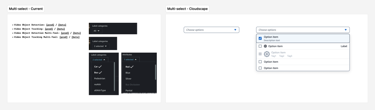
Variables!
Just as I was finishing re-building the Cloudscape library to support both Dark Mode and Compact with variants, Figma launched Variables. By leveraging Variables I was able to reduce the number of variants per component by 3/4ths.
Just as I was finishing re-building the Cloudscape library to support both Dark Mode and Compact with variants, Figma launched Variables. By leveraging Variables I was able to reduce the number of variants per component by 3/4ths.
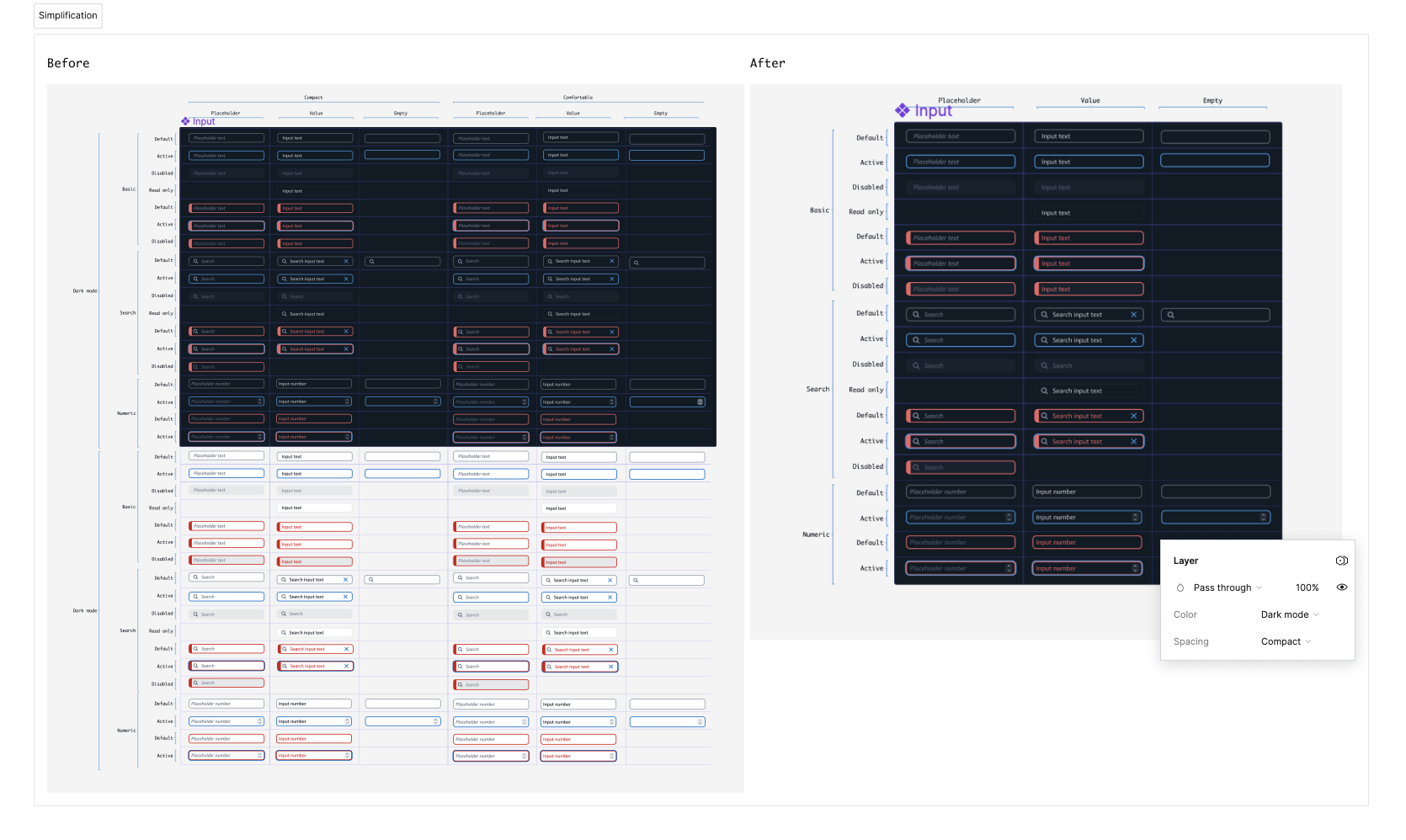
For example, with complex components such as the input field, I could reduce its total number of variants from 152 to 38, a far more manageable and maintainable number, while improving the library's overall usability.
New components
A collection of components and made for the AI/ML design library.
![]()
![]()
![]()
![]()
![]()
A collection of components and made for the AI/ML design library.


UX enhancements
To Exploration of new functional UX based complex tooling use cases including
The shell
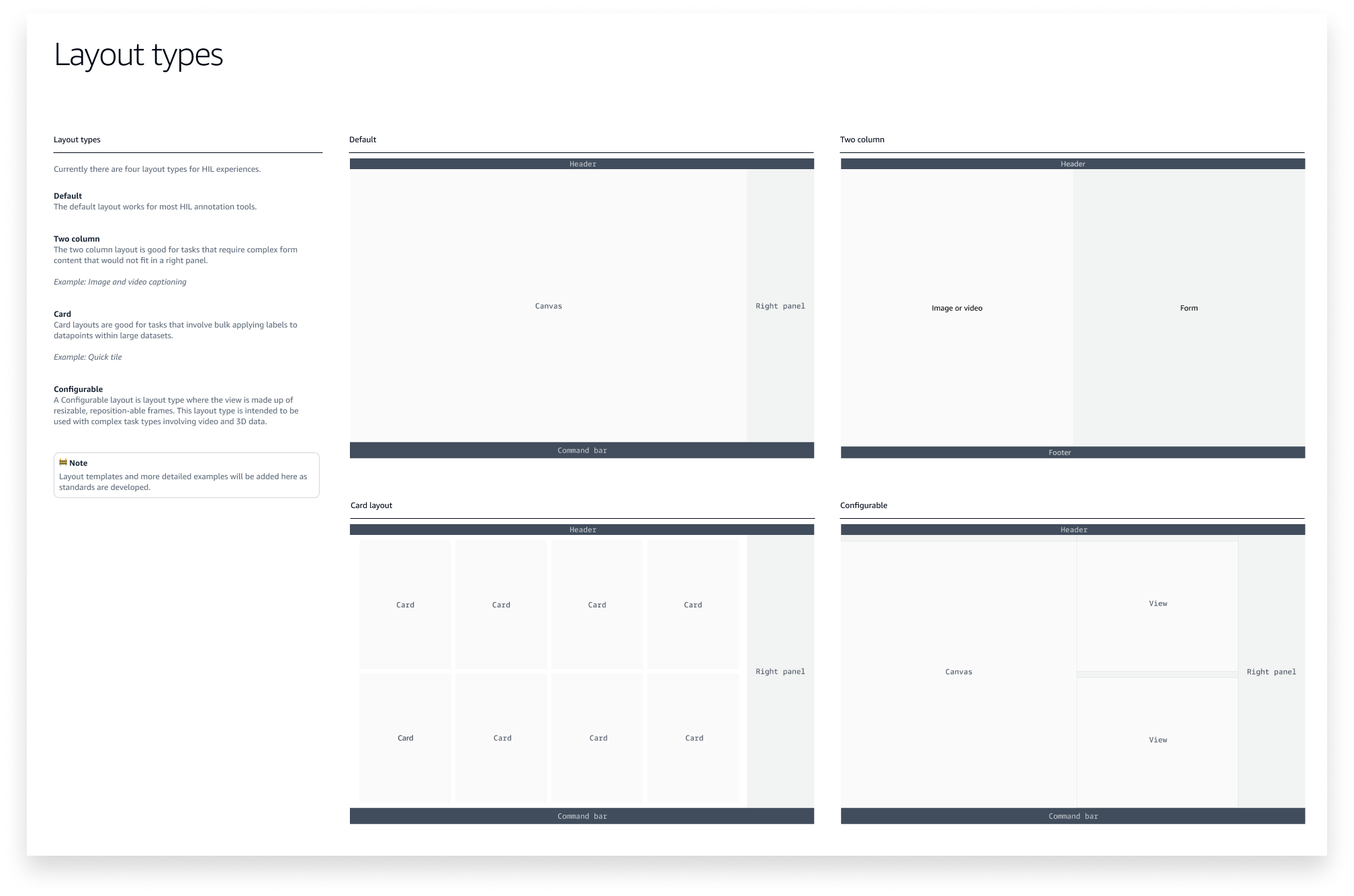
Because many of the annotation tools were built ad-hoc, there were differences in how they were laid out. To simplify, it was important to establish common layout patterns for the tools to be based on.
Because many of the annotation tools were built ad-hoc, there were differences in how they were laid out. To simplify, it was important to establish common layout patterns for the tools to be based on.
Of the 19 tools I examined across 7 use cases, each could be unified under 4 layout types.

Unified UI and page templates
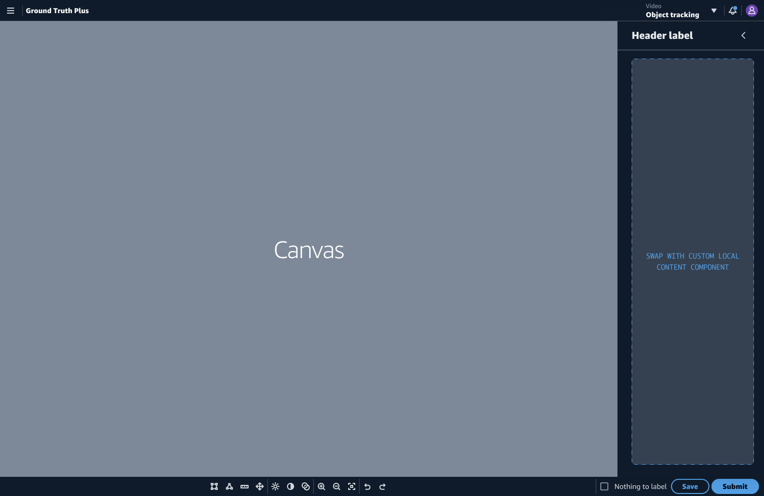
With layouts defined, I created page templates using my new navigation, command bar, and side panel components, which I built using slot components to make components as configurable and flexible for users as possible.
With layouts defined, I created page templates using my new navigation, command bar, and side panel components, which I built using slot components to make components as configurable and flexible for users as possible.
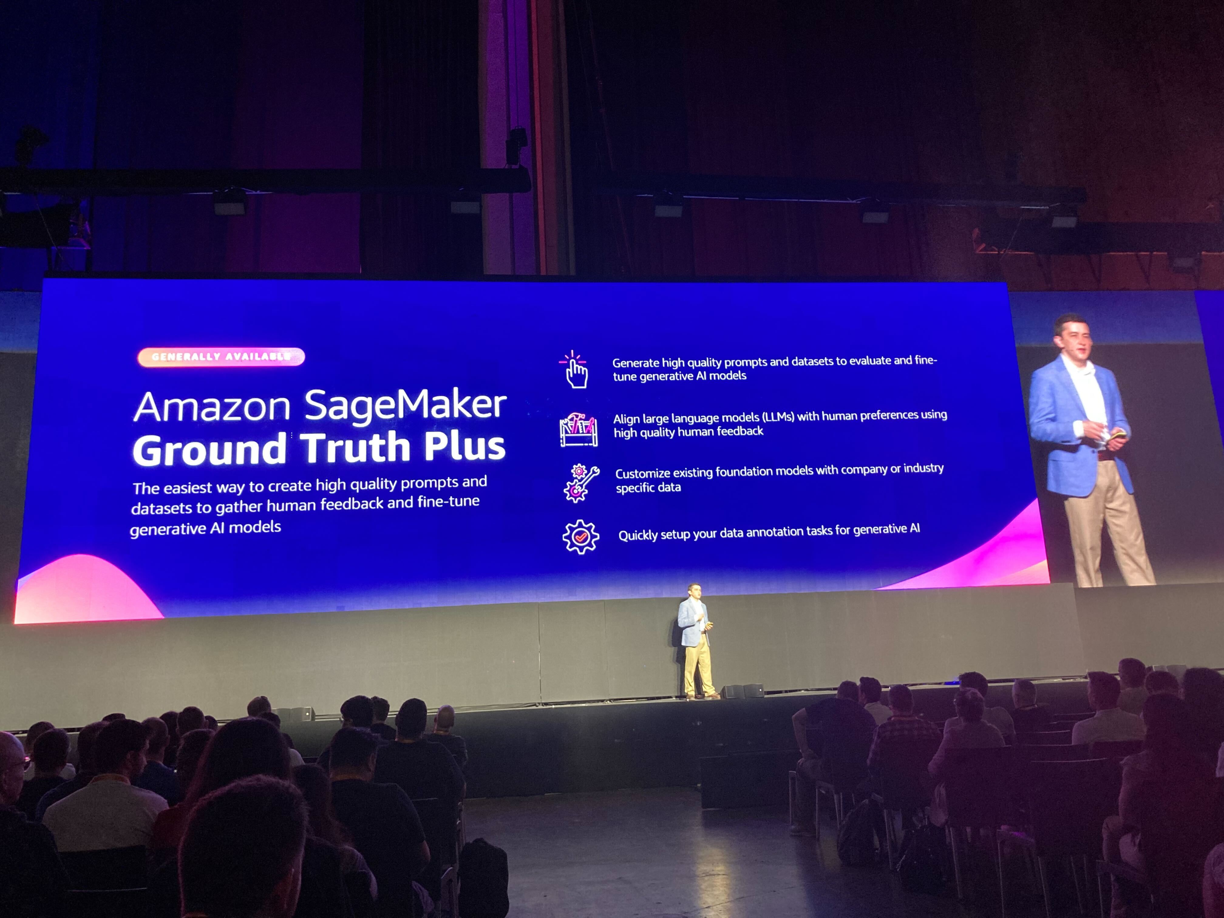
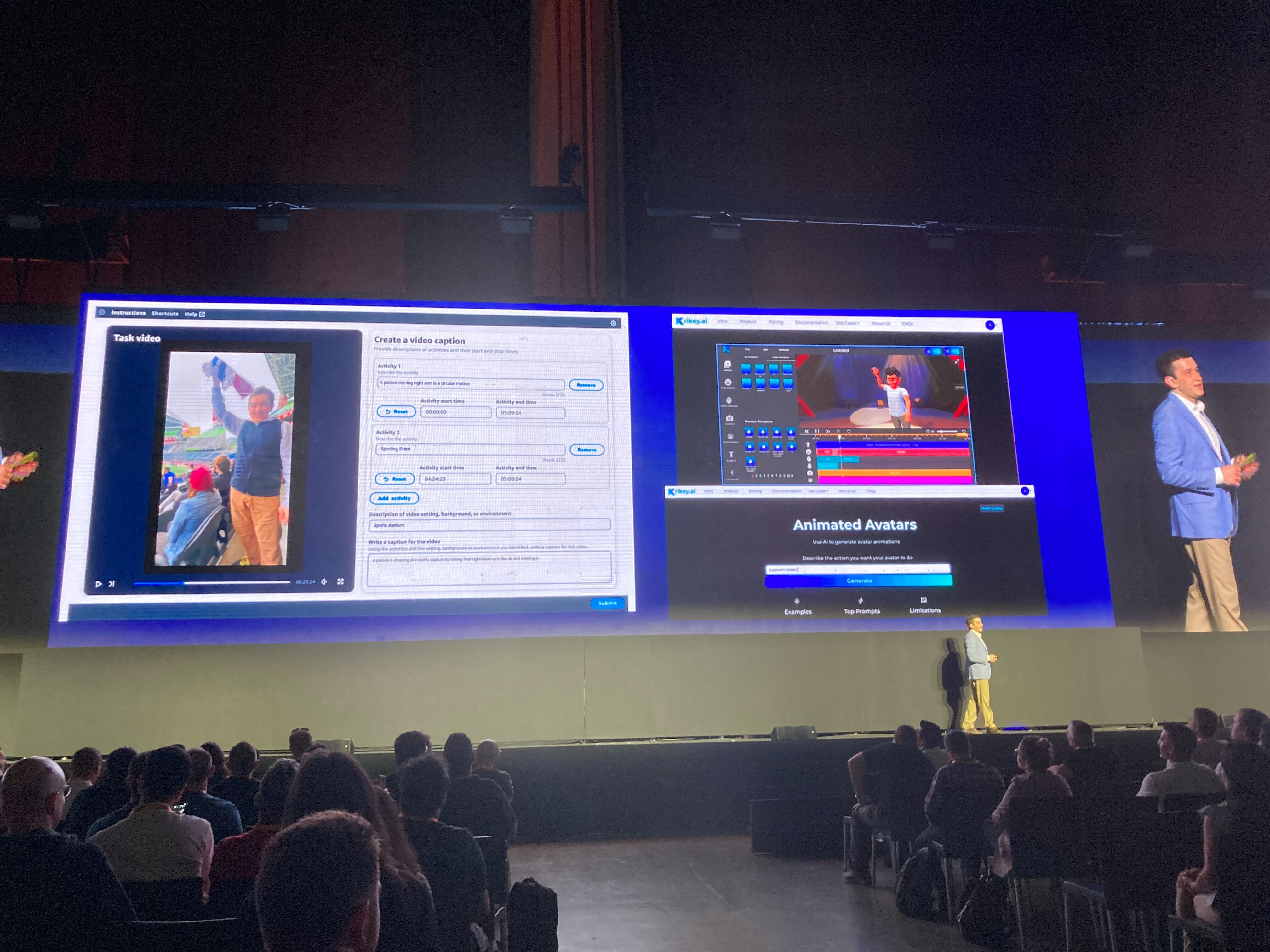
Product recommendations: GA launch
Driving impact
Leading up to a large conference and product launch, towards the end of my project, I had the opportunity to re-imagine the experience and interfaces of several AI/ML annotation tools using the system I had been working on.
The reimagined UI I worked on was included in the product’s GA launch presentation at the conference and in a corresponding blog post.
![]()
Product recommendations: Going further
In the final stage of my project I re-imagined the UI of other annotation use cases, including the first four UIs I worked on to improve their usability and accessibility as examples for higher leadership to demonstrate what their org’s products could look like with focused design support, and adoption and investment into the system I had started.
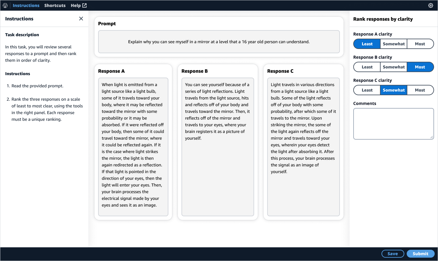
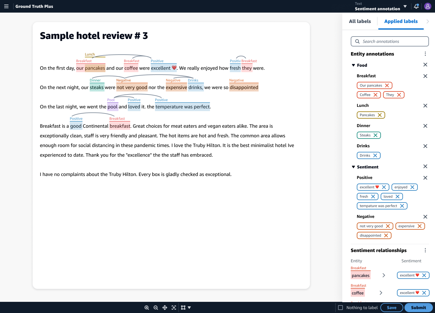
Text annotation
My focus with the text annotation tools was improving color accessibility as well as the information hierarchy.
My focus with the text annotation tools was improving color accessibility as well as the information hierarchy.
Before
![]()

After
![]()
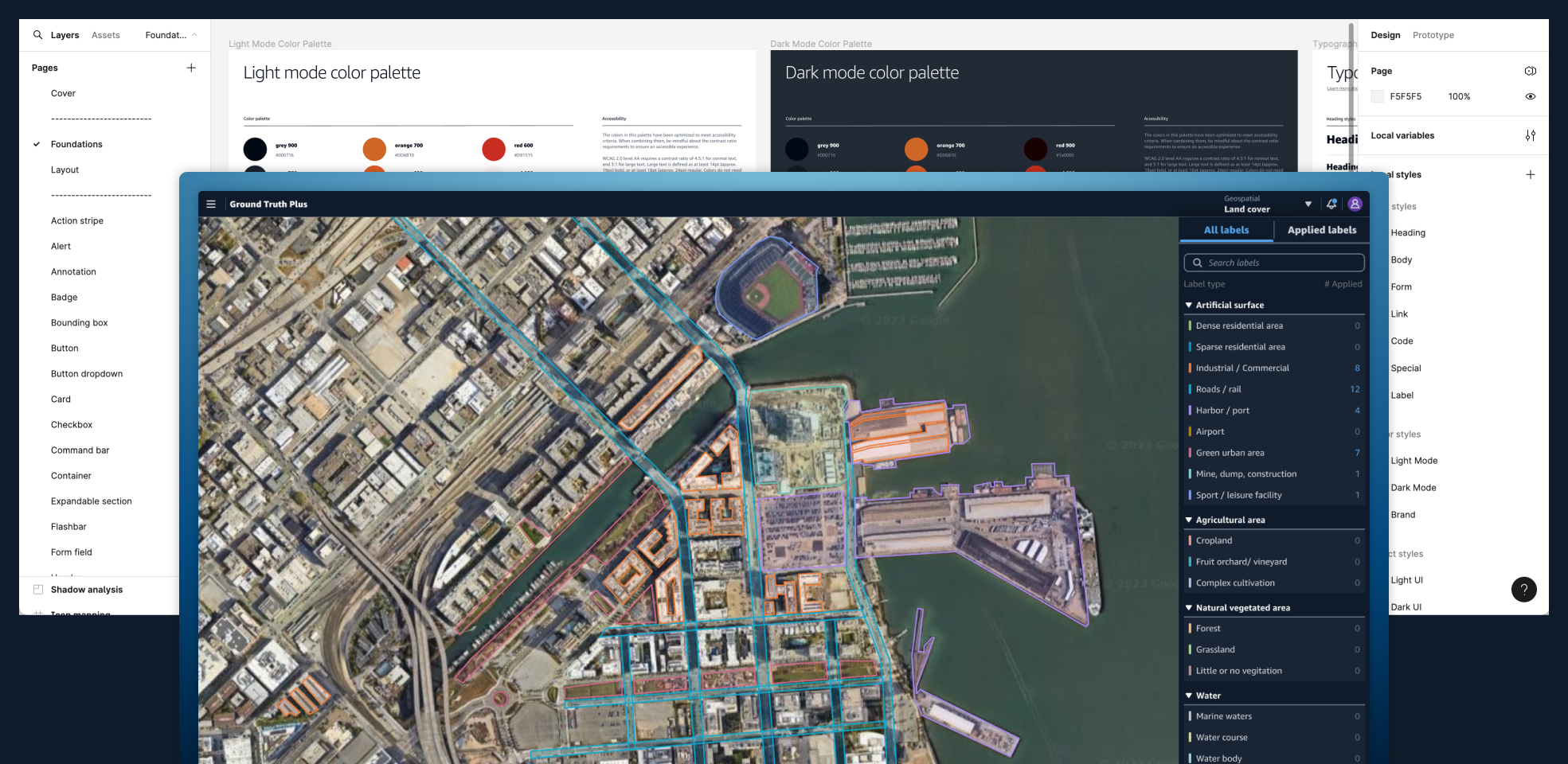
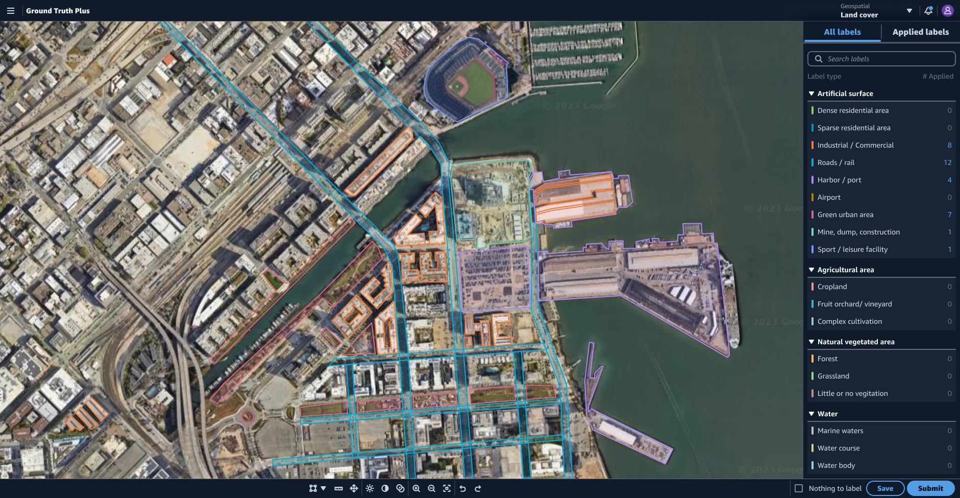
Geospatial labeling
Using the shell I designed earlier, the drawing tools needed for geospatial labeling became far easier for users to find and use with a clearer path for editing labels that have been applied.
Using the shell I designed earlier, the drawing tools needed for geospatial labeling became far easier for users to find and use with a clearer path for editing labels that have been applied.
Before
![]()
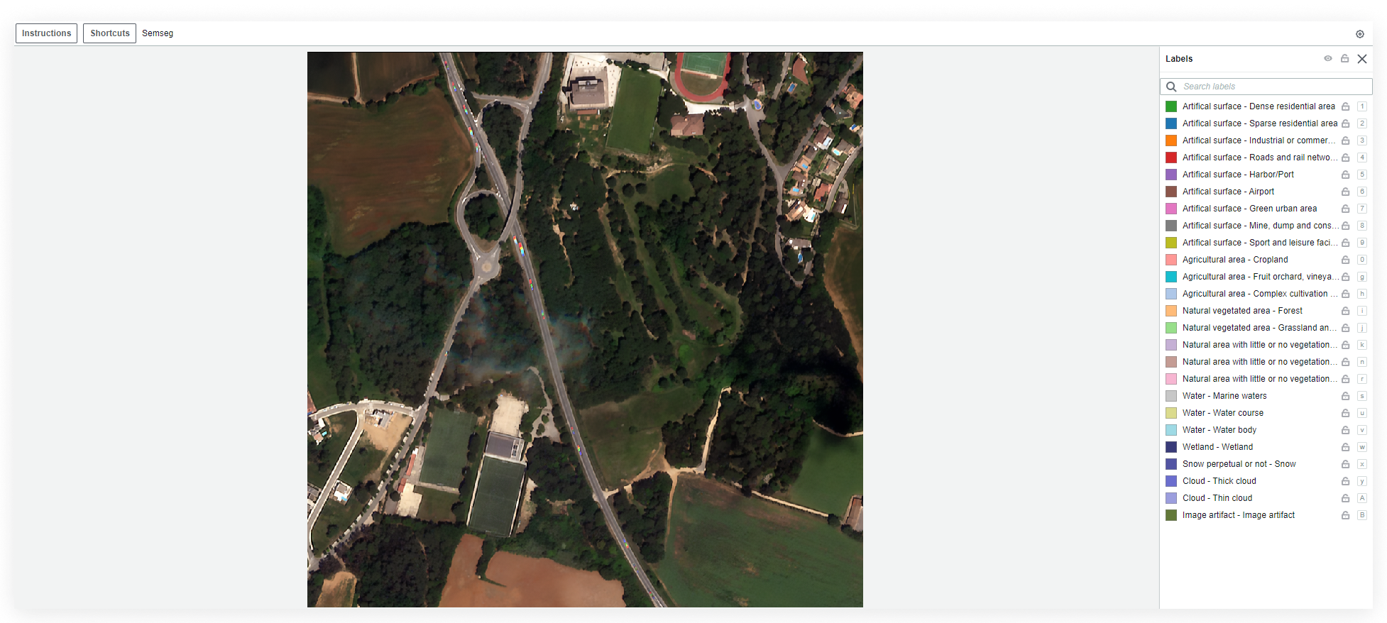
After
![]()
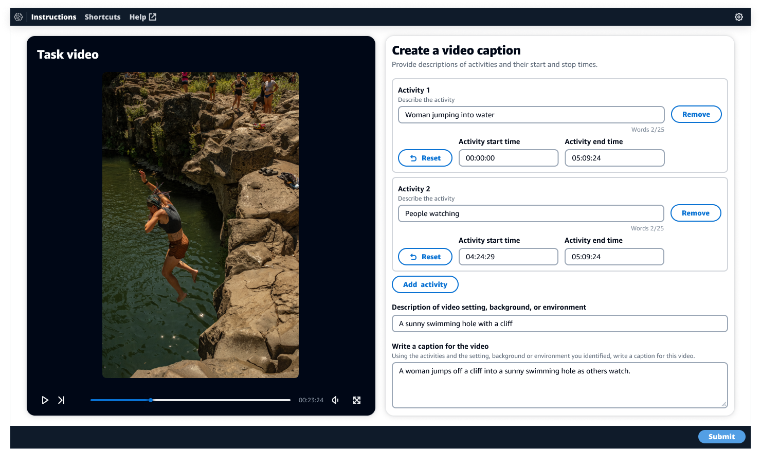
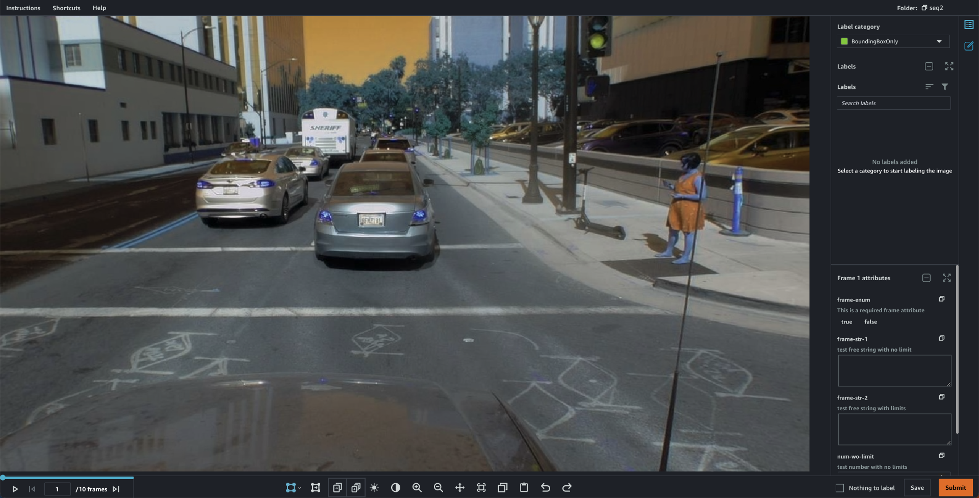
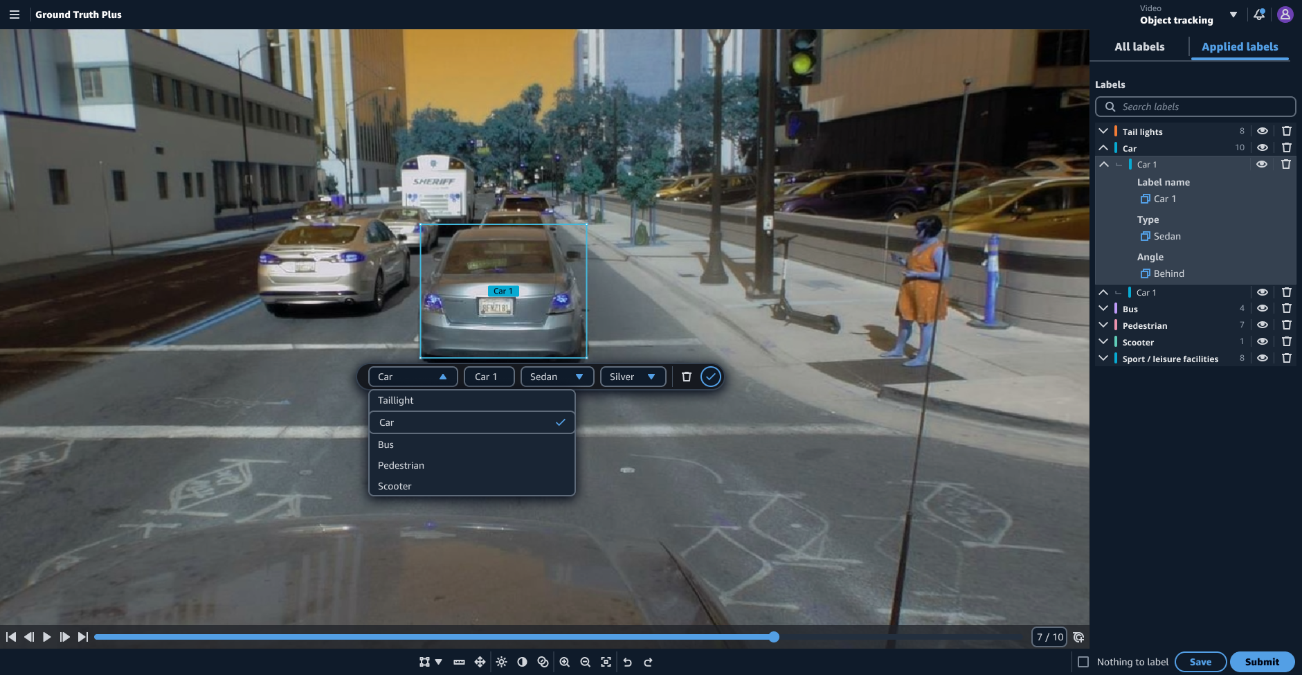
Object tracking
An essential improvement to the object tracking UI was pulling the video controls from the command bar and moving them into a dedicated video player pattern. When the video controls were in the command bar, they were disconnected from where users would expect them to be and took up much-needed real estate in the command bar in more complex versions of the use case.
An essential improvement to the object tracking UI was pulling the video controls from the command bar and moving them into a dedicated video player pattern. When the video controls were in the command bar, they were disconnected from where users would expect them to be and took up much-needed real estate in the command bar in more complex versions of the use case.
Before
![]()
After
![]()
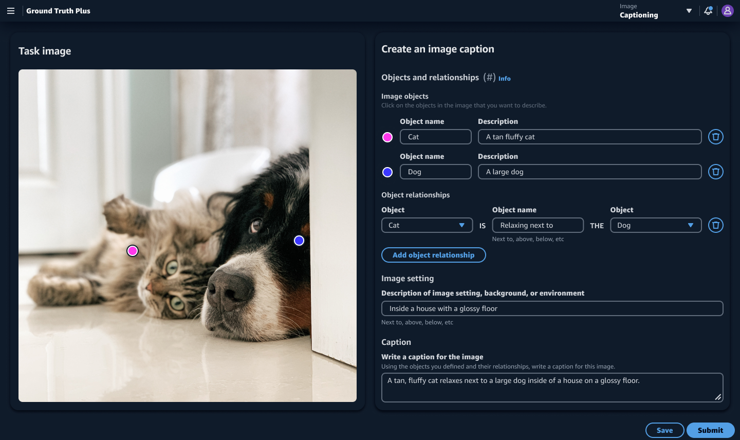
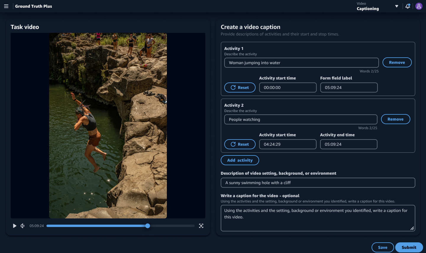
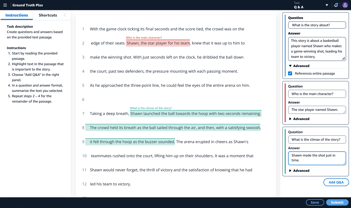
Improvements to initial UIs
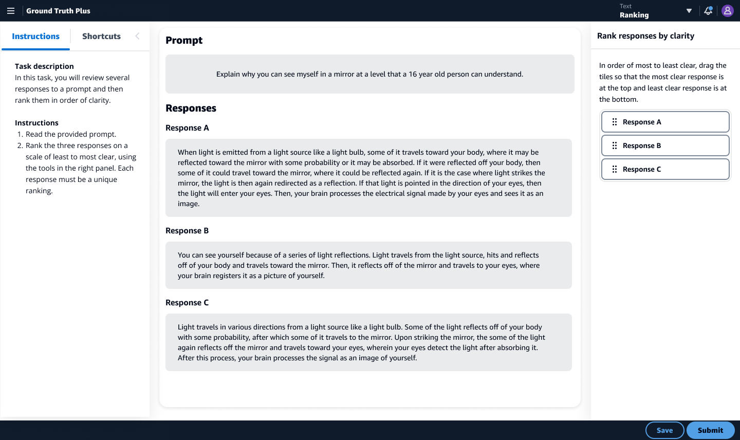
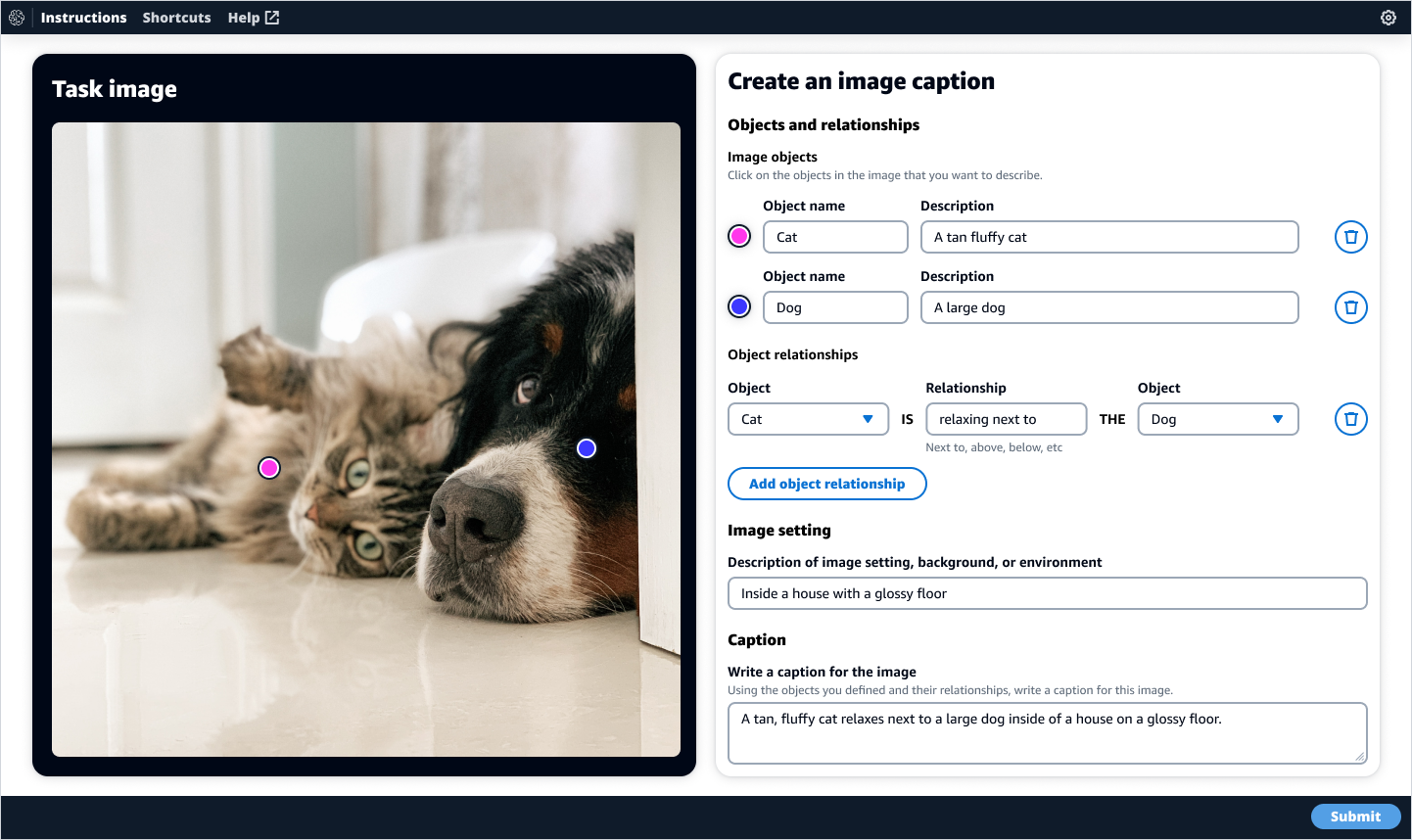
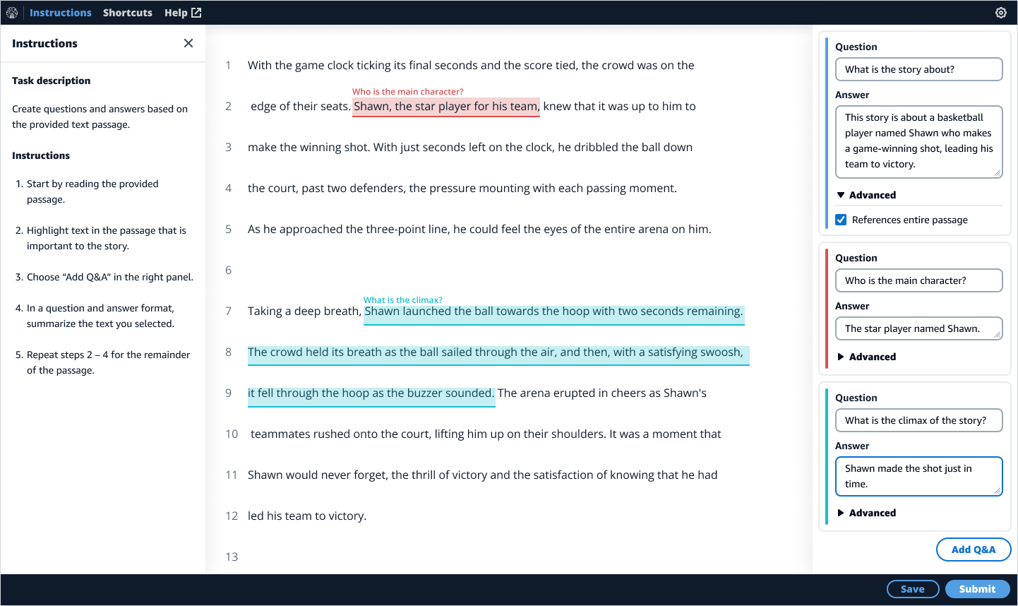
A few examples of improvements to the original UIs included making the image and video caption tools dark by default to help users focus on the imagery, and the response-based question and answer UI would use horizontal rows instead of columns to improve the readability of longer text blocks.