Building a scalable multi-product design system
Hexagon design system
Internal team:
Sr. Designers: Blake (me), Claudia
Design lead: Rayn
Art director: Kerrie
PM: Lisa
Original scope: 4 months
Total engagement: 1.25 years
Sr. Designers: Blake (me), Claudia
Design lead: Rayn
Art director: Kerrie
PM: Lisa
Original scope: 4 months
Total engagement: 1.25 years
Background
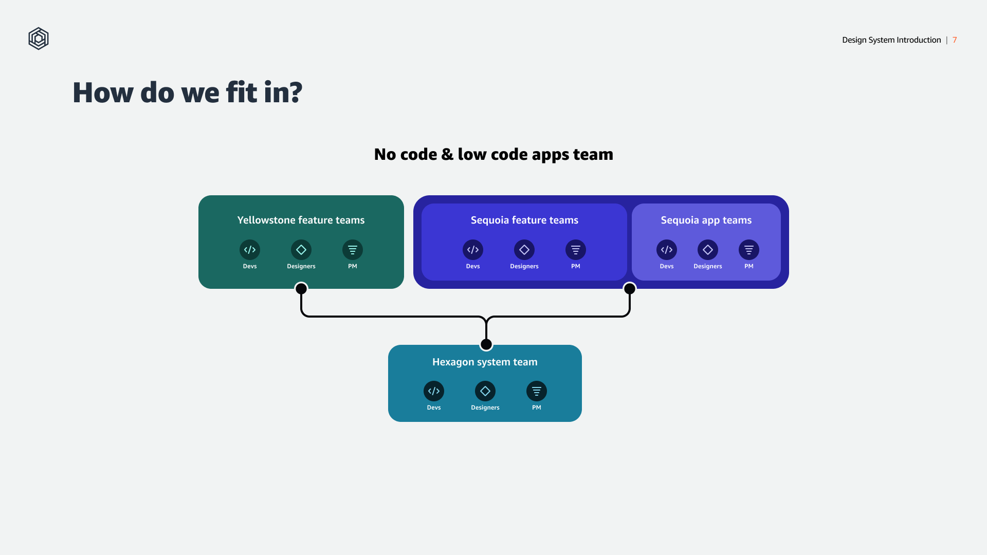
A team within AWS is working on a suite of tools for building custom apps. At the time, consisting of a core, legacy product and two newer supporting products, each managed by its own product team.
A team within AWS is working on a suite of tools for building custom apps. At the time, consisting of a core, legacy product and two newer supporting products, each managed by its own product team.
The challenge
The client’s design system had become unmaintained. It was unused by the client’s recently hired younger designers, causing chaos and friction between their design and dev teams and putting the product the system was initially supposed to support at risk.
The client’s design system had become unmaintained. It was unused by the client’s recently hired younger designers, causing chaos and friction between their design and dev teams and putting the product the system was initially supposed to support at risk.
Project goal
Replace the old system with a flexible, scalable, multi-product design system supported by the formation of a dedicated design systems team, doc site, and governance model.
Replace the old system with a flexible, scalable, multi-product design system supported by the formation of a dedicated design systems team, doc site, and governance model.
Getting started: Discovery phase
The discovery phase involved multiple methods in order to establish a well rounded understanding of the product org and it’s challenges.
Technical gaps working sessions
Meetings with client engineers and design stakeholders about the current doc site to understand their goals and to find alignment on a path towards a doc site and source of truth that would support both engineering and design users of the design system.
Meetings with client engineers and design stakeholders about the current doc site to understand their goals and to find alignment on a path towards a doc site and source of truth that would support both engineering and design users of the design system.
Process working sessions and demos
The internal team and I conducted working sessions with org leaders and client subject matter experts to understand the different product verticals the new system would need to support and the teams' workflows to create a journey map of their current process.
The internal team and I conducted working sessions with org leaders and client subject matter experts to understand the different product verticals the new system would need to support and the teams' workflows to create a journey map of their current process.
User interviews
To understand the client’s challenges with their existing system, the internal team and I conducted 20 interviews with members of the organization’s design, engineering, and product teams.
To understand the client’s challenges with their existing system, the internal team and I conducted 20 interviews with members of the organization’s design, engineering, and product teams.
Affinitizing insights
Armed with our notes and transcripts, the internal team and I used an affinity diagram to identify common themes, patterns, and pain points among the combined insights from our interviews.
Armed with our notes and transcripts, the internal team and I used an affinity diagram to identify common themes, patterns, and pain points among the combined insights from our interviews.


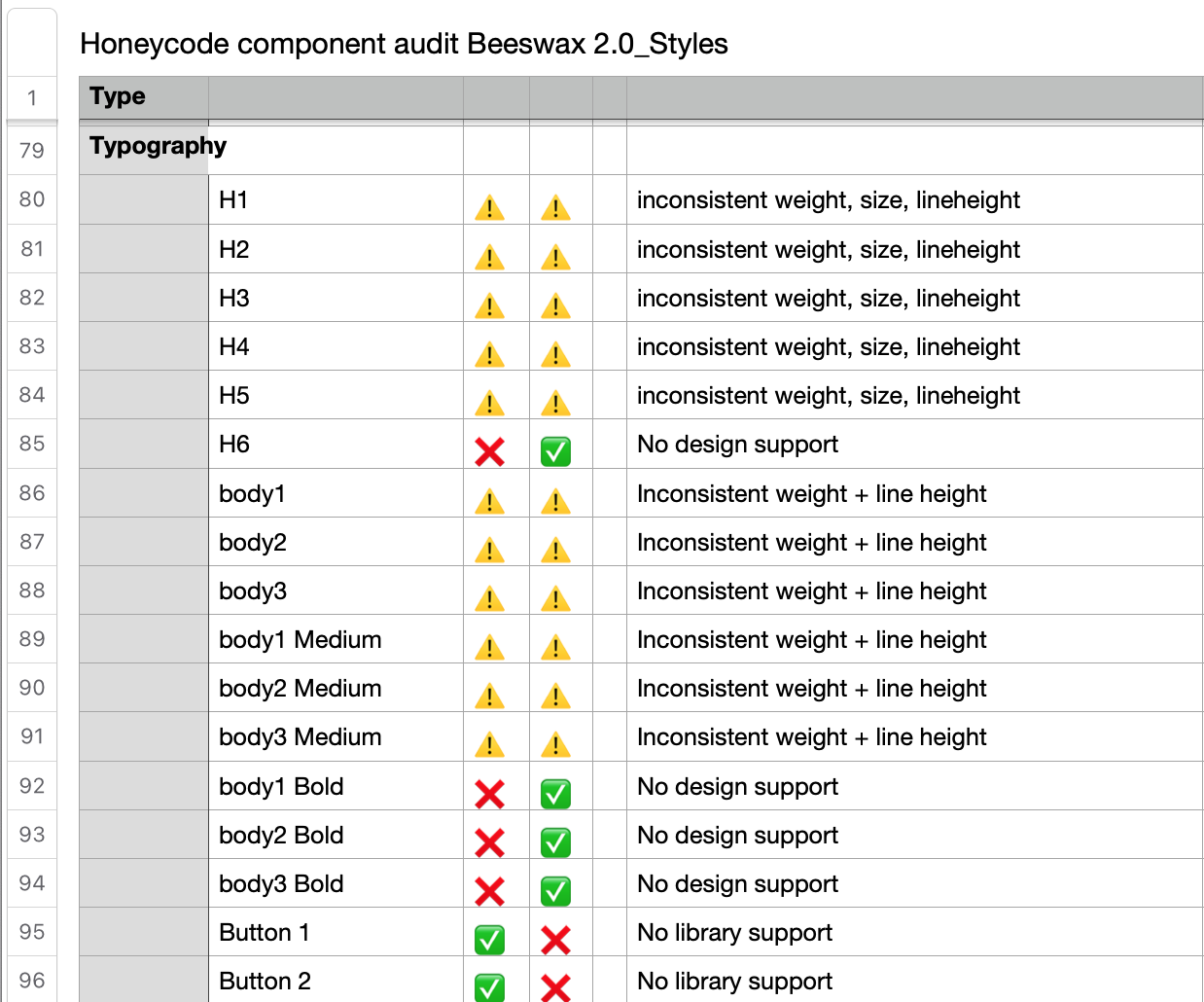
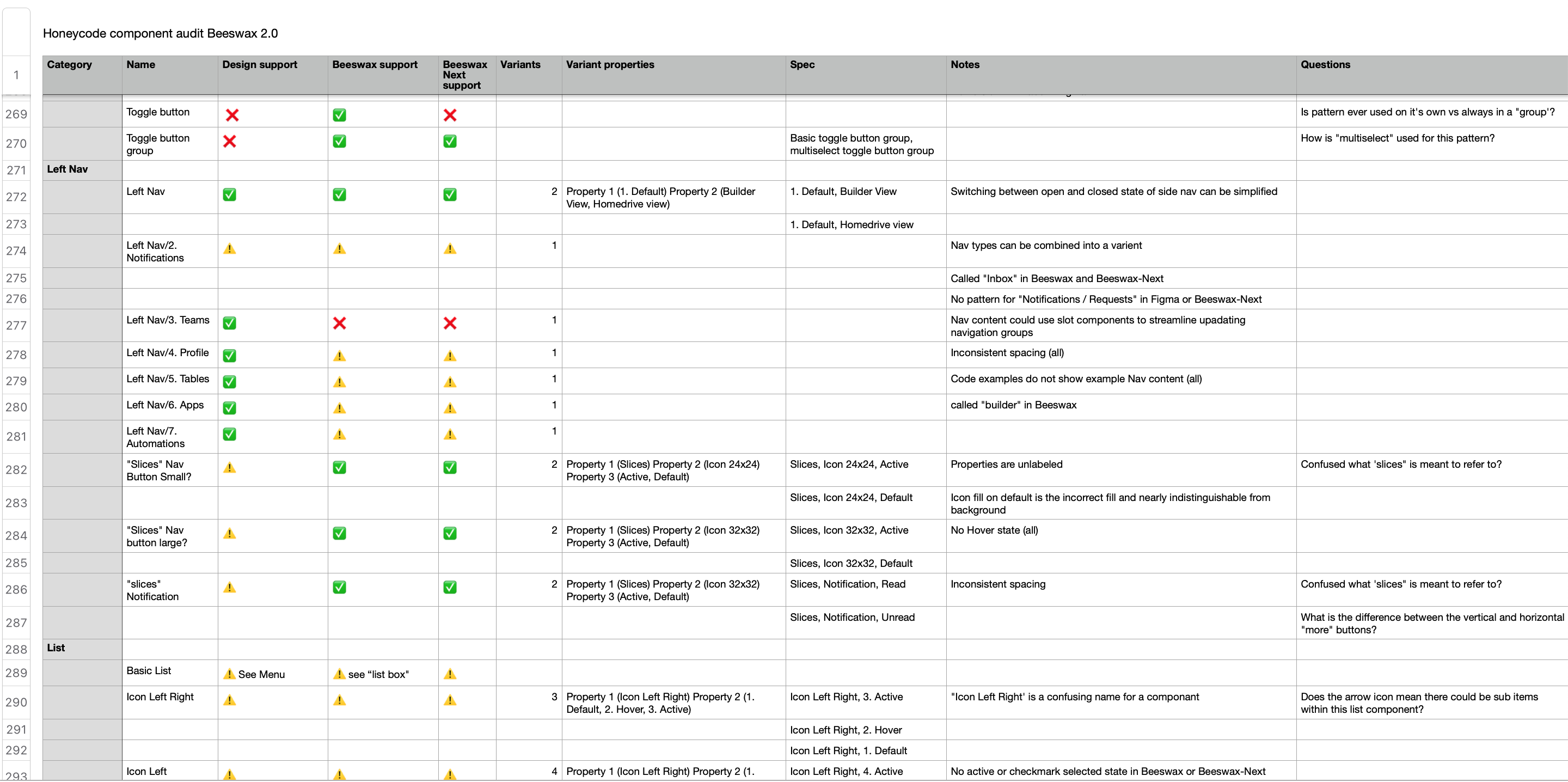
UI and systems audit
I audited the core product, the existing design system, and emerging patterns from in-progress design files to understand the current system’s usage and gaps from an implementation standpoint. One of the key outcomes of this part of the process was learning and documenting what this org’s components and properties were named so that the new system could be built using existing, accepted terminology.
I audited the core product, the existing design system, and emerging patterns from in-progress design files to understand the current system’s usage and gaps from an implementation standpoint. One of the key outcomes of this part of the process was learning and documenting what this org’s components and properties were named so that the new system could be built using existing, accepted terminology.
Audit global summary
![]()

Styles support design vs code
![]()
Existing design system audit
![]() Cross-product analysis of component usage in the current system in code vs future.
Cross-product analysis of component usage in the current system in code vs future.
 Cross-product analysis of component usage in the current system in code vs future.
 UI current state
![]()
Auditing the core product's current state revealed many stylistic inconsistencies, including treatments, behaviors, and misaligned elements.
Auditing the core product's current state revealed many stylistic inconsistencies, including treatments, behaviors, and misaligned elements.
Emerging patterns
![]()
When looking at active design files, designers across the different products were using completely different visual styles from each other and not the existing design system.
When looking at active design files, designers across the different products were using completely different visual styles from each other and not the existing design system.
Component inventory
![]()
Informed by my combined audits, I assembled an inventory of all components that would be carried forward into the new design system, arranged them by which products would use them, and estimated their priority and effort.
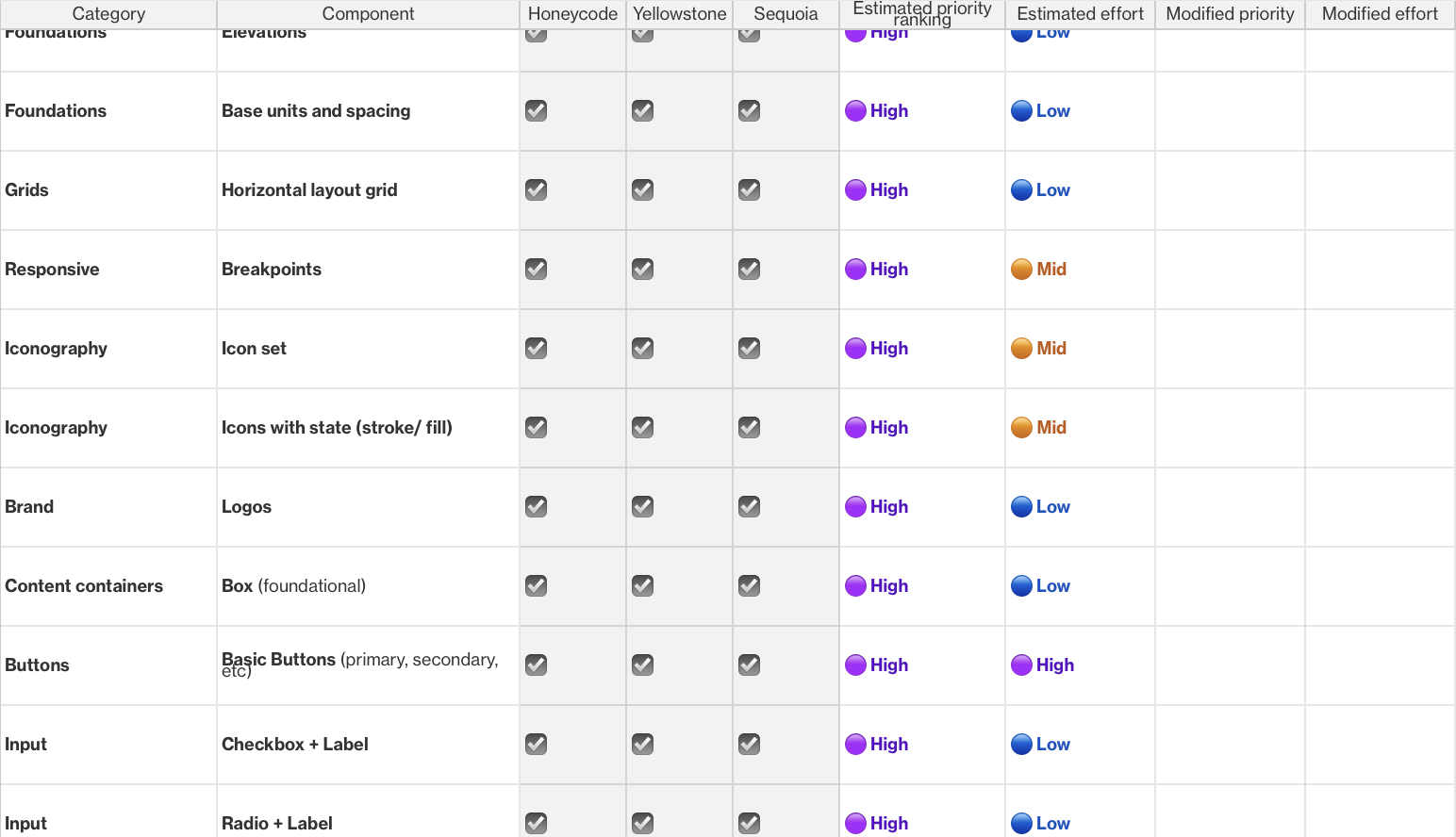
Informed by my combined audits, I assembled an inventory of all components that would be carried forward into the new design system, arranged them by which products would use them, and estimated their priority and effort.
What we learned in our discovery phase was:
1
The organization had three products, each with their own brand and UI. Plus, we needed full themability to support the customer’s custom apps.2
Like many teams within AWS, this org was moving FAST, and it was causing problems.3
The product teams had no established delivery processes. 4
The project did not have the support of the engineering leaders up front. There was no one to build our components!5
Strong opinions about doc site technology ultimately caused significant delays in having a doc site in time for launch.Forming our recommendation
Strategy writing
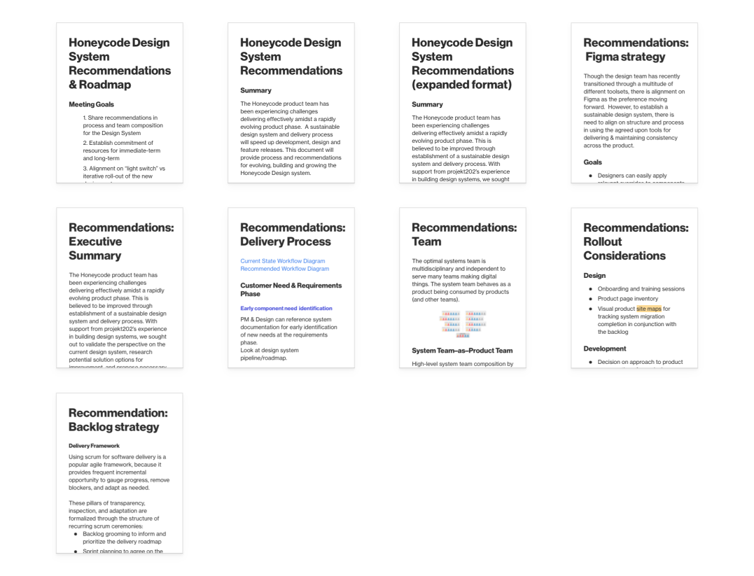
To conclude the project’s discovery phase while taking into account the reading culture of our client, the internal team and I assembled summeries of our findings and synthisized them into 16+ pages of of strategy documents and reccomendations to get buy in from top level stakeholders. Documents I took responsibility for during this phase included:
To conclude the project’s discovery phase while taking into account the reading culture of our client, the internal team and I assembled summeries of our findings and synthisized them into 16+ pages of of strategy documents and reccomendations to get buy in from top level stakeholders. Documents I took responsibility for during this phase included:
- How design tokens could be utialized in conjunction with the Figma Token Studio plugin to acheive the project vision of a flexible, themable design system based on a single core component libraryA rollout strategy.
- A collection of well documented Figma best practices
- A strategy for how Figma capabilities could be leveraged to acheive a more sustainable and connected library ecosystem.
On managing multi-brand design systems
To illustrate why the need for a theme-able library was critical to the success of the design system, it was essential to highlight the risks the team would accept if we did not build a tokenized library. To communicate this, I presented a hypothetical scenario with the steps needed to make a simple change to medium-button-sized buttons if the systems team were required to maintain three entirely separate component libraries for each of the three products vs. a single central library built with design tokens. With the design tokens approach, the design system team can operate more efficiently, maintain consistency, and have a much lower risk of introducing breaking changes and inconsistencies.
To illustrate why the need for a theme-able library was critical to the success of the design system, it was essential to highlight the risks the team would accept if we did not build a tokenized library. To communicate this, I presented a hypothetical scenario with the steps needed to make a simple change to medium-button-sized buttons if the systems team were required to maintain three entirely separate component libraries for each of the three products vs. a single central library built with design tokens. With the design tokens approach, the design system team can operate more efficiently, maintain consistency, and have a much lower risk of introducing breaking changes and inconsistencies.
Building components from the ground up: Design phase
Prioritization workshop
Pulling the component checklist created at the end of the discovery phase into a Figjam board with a quick library, I pulled together with custom voting stickers; I ran a workshop with stakeholders from the client’s design and engineering teams so that they could vote on the order that foundations and components should be designed and handed off. At the end of this workshop, we had a prioritized list of 105+ components and the team’s first glimpse of our design system roadmap.
Pulling the component checklist created at the end of the discovery phase into a Figjam board with a quick library, I pulled together with custom voting stickers; I ran a workshop with stakeholders from the client’s design and engineering teams so that they could vote on the order that foundations and components should be designed and handed off. At the end of this workshop, we had a prioritized list of 105+ components and the team’s first glimpse of our design system roadmap.

Backlog creation
After finalizing the priority of components, the table was reformatted to have the information we wanted to include on a design ticket. With my PM and a lot of trial and error we succussfully bulk upload the entire prioritized list of components into SIM, Amazon’s internal sprint planning tool, establishing the design system team’s backlog.
After finalizing the priority of components, the table was reformatted to have the information we wanted to include on a design ticket. With my PM and a lot of trial and error we succussfully bulk upload the entire prioritized list of components into SIM, Amazon’s internal sprint planning tool, establishing the design system team’s backlog.
File organization
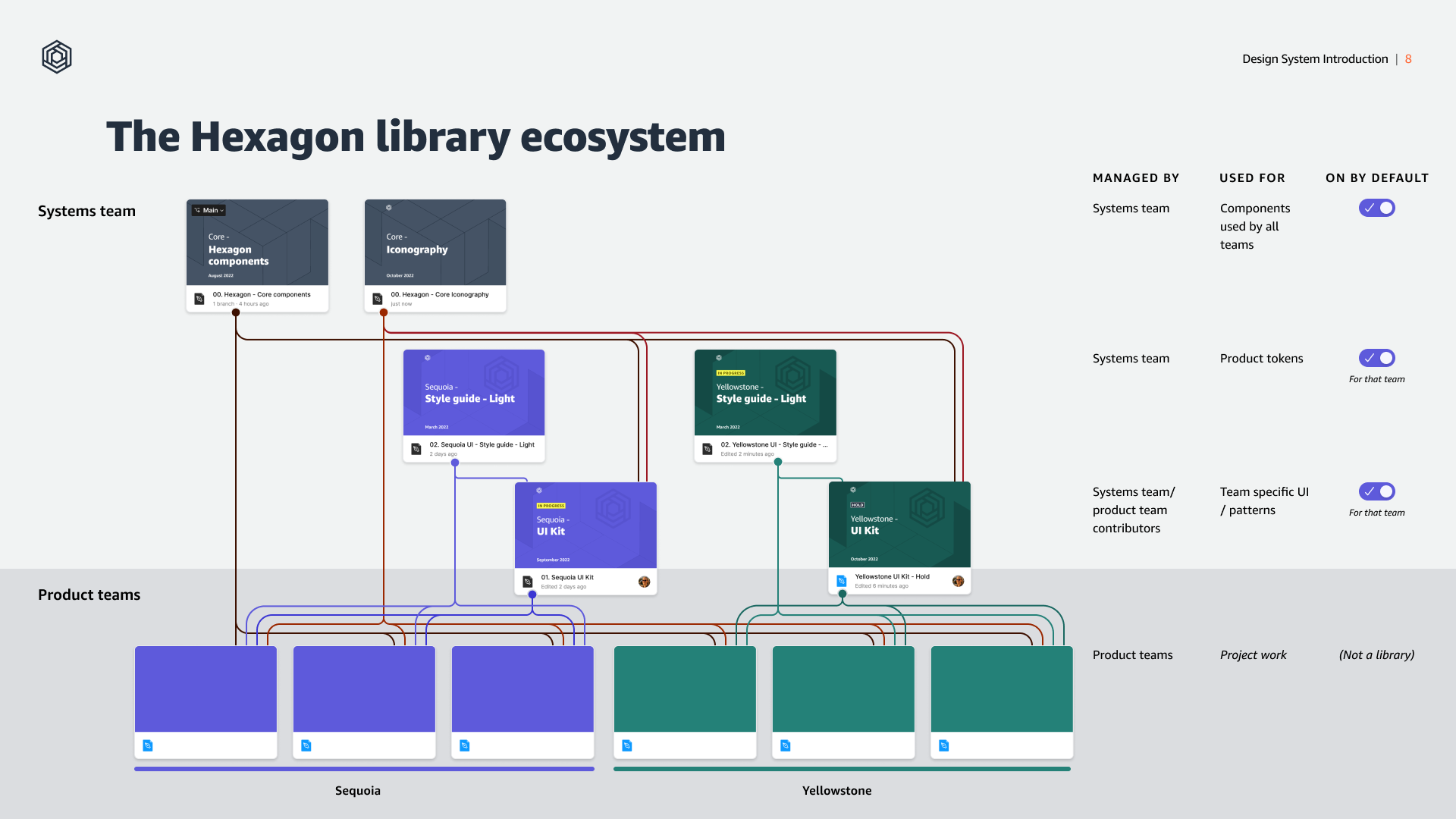
Not only was the team building a design system from the ground up, we were building a design system team from the ground up. Sure, we needed to build out styles and components, but where would we keep them?! What I researched and successfully made a case to design stakeholders was that the design system team and the files it creates and maintains should be kept in a dedicated team within Figma rather than spread out across other product teams within our figma org. Interestingly, best practices on where and how design sytems should be stored in Figma and why is not well documented or discussed.
![Showing precedent for creating a dedicated team within Figma for storing library files.]()
Not only was the team building a design system from the ground up, we were building a design system team from the ground up. Sure, we needed to build out styles and components, but where would we keep them?! What I researched and successfully made a case to design stakeholders was that the design system team and the files it creates and maintains should be kept in a dedicated team within Figma rather than spread out across other product teams within our figma org. Interestingly, best practices on where and how design sytems should be stored in Figma and why is not well documented or discussed.
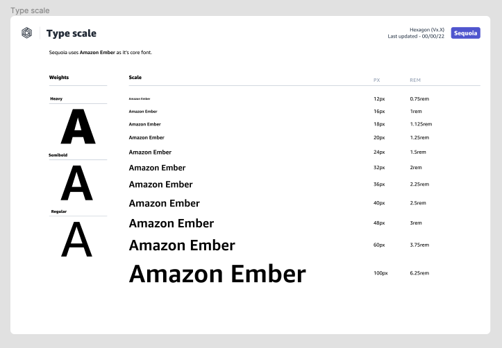
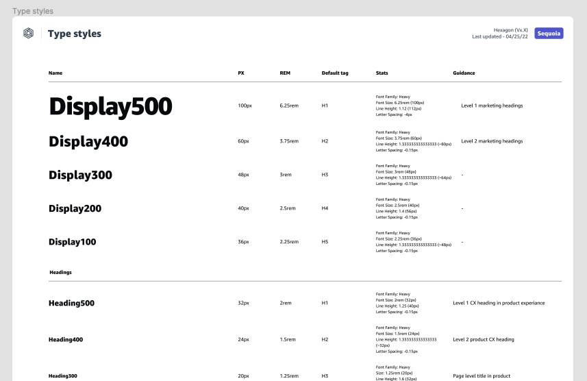
Setting a strong foundtion
To ensure foundations could be themeable, it was important from a naming perspective that our accessible colors, text styles, spacing units, etc., were generically named so that values could be changed to anything without causing a breaking change. To support this, I ensured that styles for a given product would be stored in dedicated library files.
To ensure foundations could be themeable, it was important from a naming perspective that our accessible colors, text styles, spacing units, etc., were generically named so that values could be changed to anything without causing a breaking change. To support this, I ensured that styles for a given product would be stored in dedicated library files.


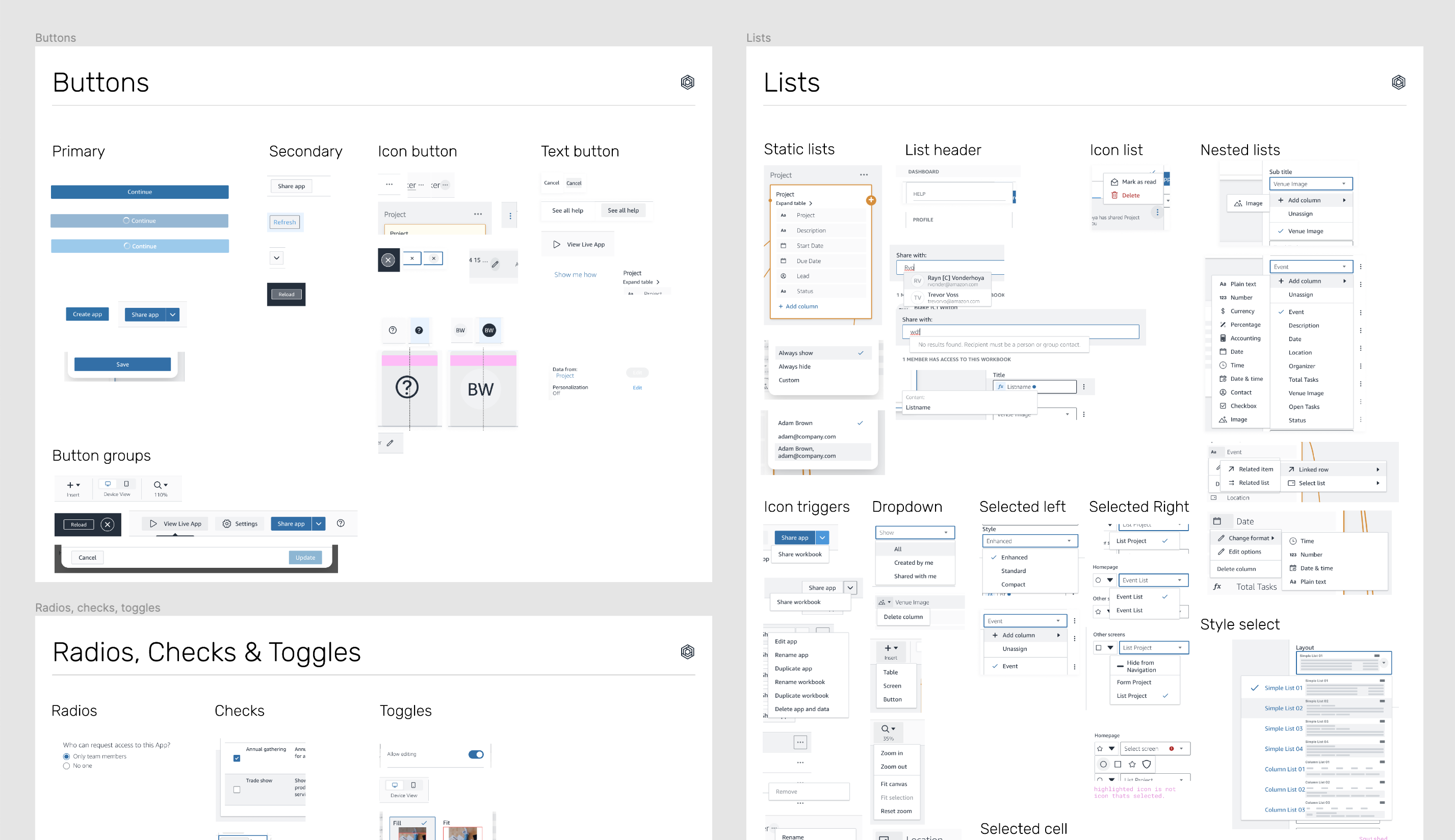
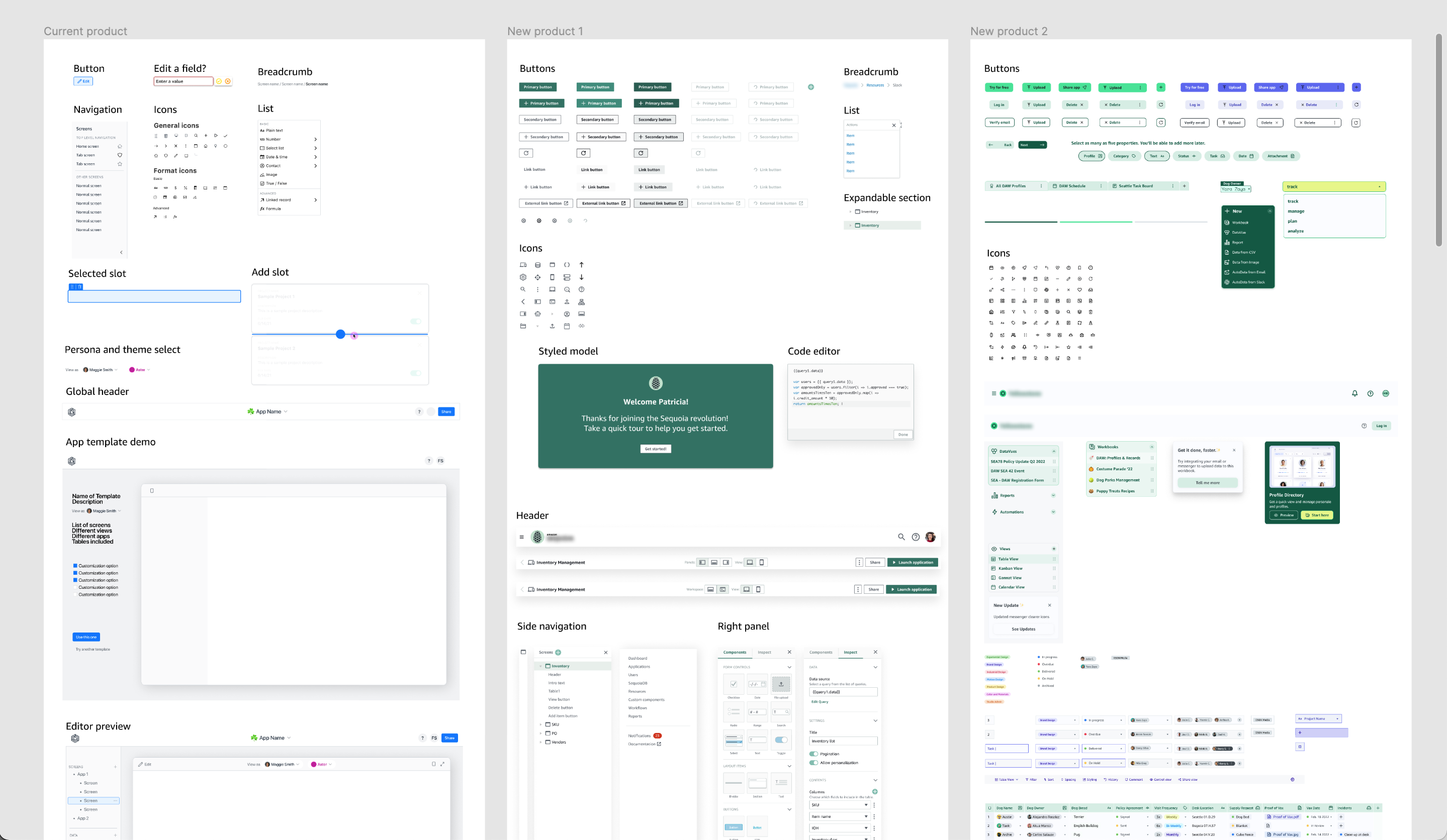
Building components
Parallel to the discovery work our team was conducting, Kerrie, our Art Director, had been collaborating with the client’s Creative Director on establishing the new look and feel of the core product. We then used these visual explorations as a jumping-off point for building the new component library.
To keep our progress with building components on track, I regularly reviewed our process for opportunities to improve. Here are a few process improvements I advised on to help us stay on track.
1
Playing to our strengthsQuickly pivoting to moving Kerrie, our Art Director, a sprint ahead of the systems designers for a visual design pass on new components before handing off to Claudia and me to build out flexible components with variants and states.
2
Organization is keyKeeping a complex, fast-moving design system from getting messy requires close attention. To address this, I introduced a staging file to create a clear separation between in-progress design and where completed components are migrated into the main library file at the end of each sprint, reducing confusion during handoff.
3
Still no docsite With the docsite well behind when the library needed to be published, the design systems team had to adapt and build all documentation directly into the Figma library.
4
Addapting new capabilitiesFigma's Component Property features were released in the middle of building the core library. To take advantage of these new, powerful features, I got a task created for me in the backlog to refactor and simplify existing Figma components over a few sprints so that users of our system would have the best possible experience at launch. Shout out to our design intern Ethan who was super helpful in this effort.
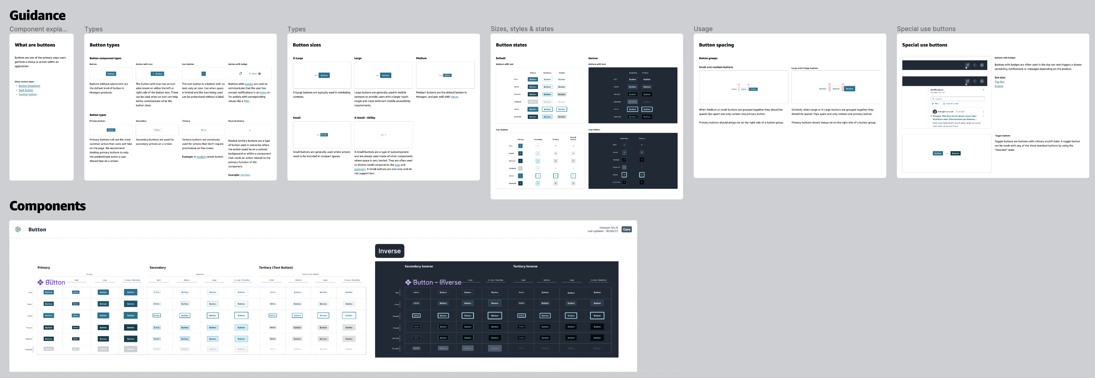
One of the reasons I recommended the component library be organized with components on their own dedicated pages was so that the library file itself mirrored a docsite-like experience for users of our system. This meant adding frames with component descriptions, states, do’s and don’ts, spacing guidelines, and other documentation. It also meant adding pages to the library containing usage guidelines for complex components and concepts that may not exactly have had components of their own but existed in code, like forms and autosuggest.
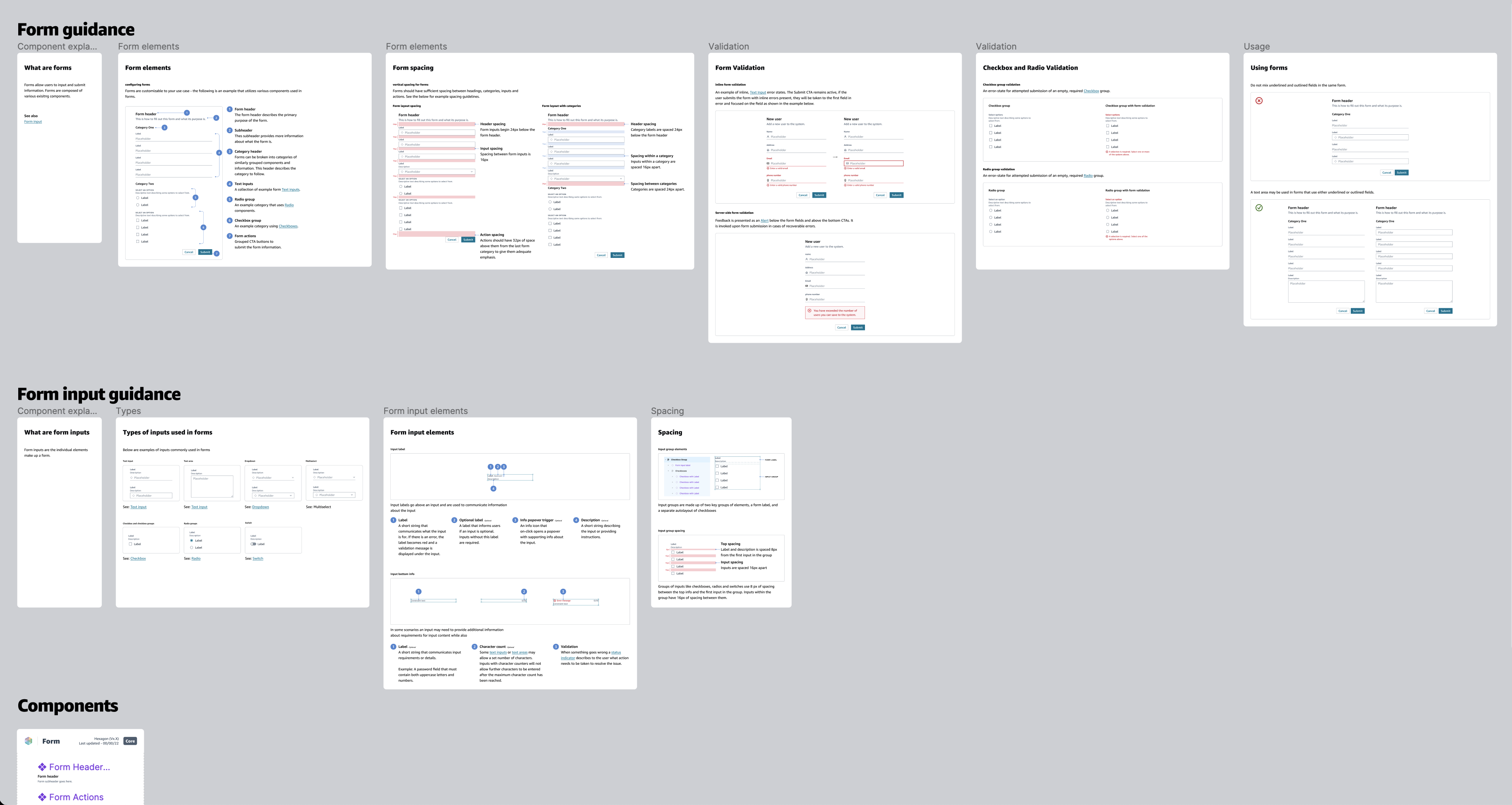
Built-in support and documentation
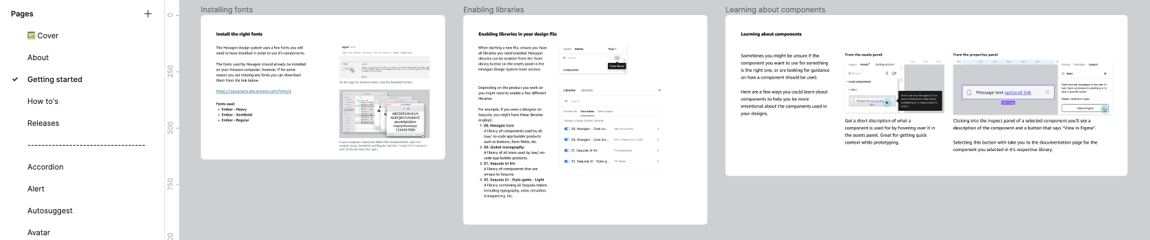
Based on our user interviews, we knew that many of our users were primarily early in their design careers and still learning Figma. To help improve the system's usability and adoption, I provided resources like where to download fonts, how to enable libraries, and, at the component level, short descriptions and links to documentation pages within the core library.
![]()
Based on our user interviews, we knew that many of our users were primarily early in their design careers and still learning Figma. To help improve the system's usability and adoption, I provided resources like where to download fonts, how to enable libraries, and, at the component level, short descriptions and links to documentation pages within the core library.
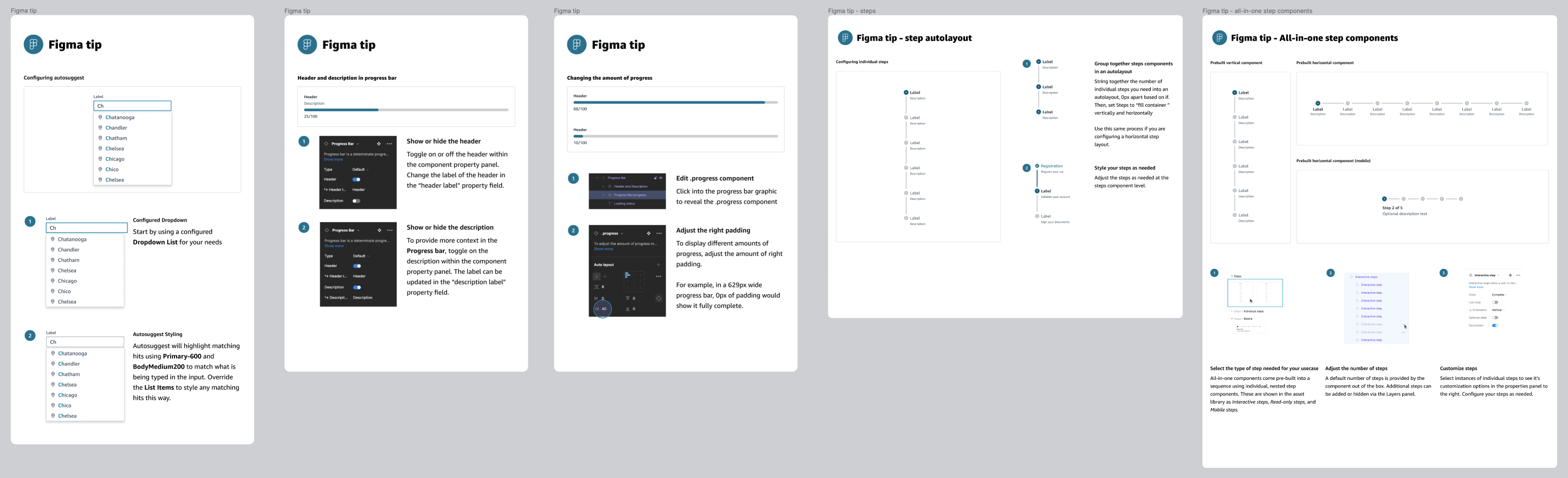
Another way we supported users through documentation was with my idea for adding informational “Figma tip” frames to component pages. These tips helped design users learn how certain components could be configured to show a specific interaction in their comps and the best way to set up auto layout to make a custom layout for their use case.
![Examples of "Figma tips" included on some of the documentation pages for components.]()
Roll out
After months of intensive component building, the MVP for the new design system was ready to be rolled out to the users in the product org in the early fall of 2022.
Pre launch design-ops
Before we hit publish on the libraries, I organized a design-ops working session with design stakeholders in the org to facilitate setting up support systems and communication channels to ensure smooth adoption by our users and long-term success. Because I was a consultant, I recommended that I not be the owner of many of these systems because of the disruption that would be caused when the engagement ended. This included the standing invites to the office hours meeting, for example.
Before we hit publish on the libraries, I organized a design-ops working session with design stakeholders in the org to facilitate setting up support systems and communication channels to ensure smooth adoption by our users and long-term success. Because I was a consultant, I recommended that I not be the owner of many of these systems because of the disruption that would be caused when the engagement ended. This included the standing invites to the office hours meeting, for example.
Lauching the system
After establishing all the support channels, we were ready to hit publish and open the design system’s libraries up for the entire org. That same week, the design systems team met with the product teams, formally introducing the system and the designers and developers managing it. This meeting included an overview of the new process and delivery improvements to remedy the challenges uncovered by the systems team in the discovery phase and how, as design system users, they can receive help from the systems team.
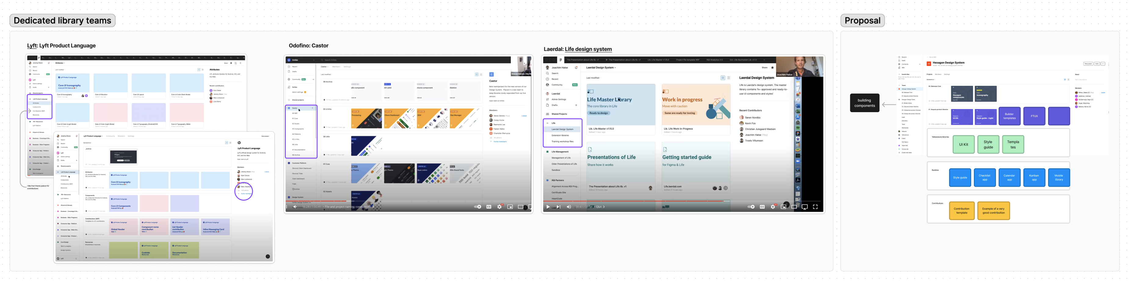
![Cross product collaboration with the design systems team]()
![Credit to Nathan Curtis for the format of this slide]()
![Watching our system's adoption gain steady growth in the first weeks of making it available was an exciting feeling.]()
After establishing all the support channels, we were ready to hit publish and open the design system’s libraries up for the entire org. That same week, the design systems team met with the product teams, formally introducing the system and the designers and developers managing it. This meeting included an overview of the new process and delivery improvements to remedy the challenges uncovered by the systems team in the discovery phase and how, as design system users, they can receive help from the systems team.
The systems team grows
When the system launched, a few changes happened on the systems team. What had been a small, tight-knit team of four advanced-level design consultants + our client-side design system stakeholder had become an ultra-efficient, component-building machine became three advanced-level design consultants + our design system stakeholder, and three new designers with varying systems experience from the client side. For the team's continued success, I had to adapt quickly by shifting from a very hands-on contributor role into a more strategic design ops role. Although this meant building fewer components, I was now able to document previously unwritten processes, create templates to speed up workflows, and ramp up the new designers on the team while shaping new processes for bug fixes, handoff, preventing breaking changes, deprecating components, and supporting the product side designers adopt and learn the system.
When the system launched, a few changes happened on the systems team. What had been a small, tight-knit team of four advanced-level design consultants + our client-side design system stakeholder had become an ultra-efficient, component-building machine became three advanced-level design consultants + our design system stakeholder, and three new designers with varying systems experience from the client side. For the team's continued success, I had to adapt quickly by shifting from a very hands-on contributor role into a more strategic design ops role. Although this meant building fewer components, I was now able to document previously unwritten processes, create templates to speed up workflows, and ramp up the new designers on the team while shaping new processes for bug fixes, handoff, preventing breaking changes, deprecating components, and supporting the product side designers adopt and learn the system.
Preventing breaking changes
With the design system published and in active adoption, the team’s new responsibility was not to break anything for our users. To prevent this, I needed to quickly find ways to ensure that changes to existing components could be done safely and that new components were not being published to the library without being fully signed off. My first steps were documenting best practices and introducing guardrails by segmenting workflows into specific locations, including the staging file, dedicated developer handoff files, and peer-reviewed branches, before merging new components or updates into the core library.
![]()
![]()
![]()
![]()
With the design system published and in active adoption, the team’s new responsibility was not to break anything for our users. To prevent this, I needed to quickly find ways to ensure that changes to existing components could be done safely and that new components were not being published to the library without being fully signed off. My first steps were documenting best practices and introducing guardrails by segmenting workflows into specific locations, including the staging file, dedicated developer handoff files, and peer-reviewed branches, before merging new components or updates into the core library.


Standardizing a unified approach to component building
At the beginning of the project, when the team was smaller, we could build new components together with a clear alignment on how they should be built and collaboratively finetuned our approach as we raced towards the target launch date. When the systems team grew post-launch, there was a pressing need to align the new system designers with our methodology for building components so that the quality of the components in the library remained consistent with our standards. Additionally, a bigger team and many more pieces in motion meant I was reviewing many more designers’ work and started to feel increasing strain the longer I had to QA a component that was not yet ready for review. My approach to addressing this challenge was two-fold.
At the beginning of the project, when the team was smaller, we could build new components together with a clear alignment on how they should be built and collaboratively finetuned our approach as we raced towards the target launch date. When the systems team grew post-launch, there was a pressing need to align the new system designers with our methodology for building components so that the quality of the components in the library remained consistent with our standards. Additionally, a bigger team and many more pieces in motion meant I was reviewing many more designers’ work and started to feel increasing strain the longer I had to QA a component that was not yet ready for review. My approach to addressing this challenge was two-fold.
1.
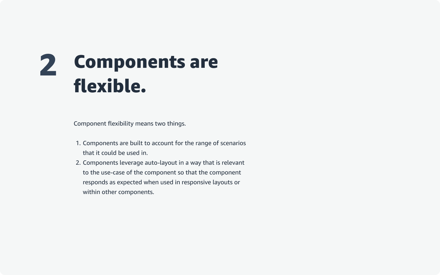
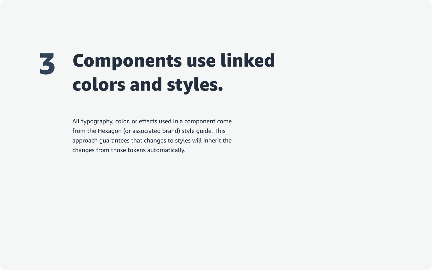
I wrote set of design tenets for the systems team to align the team’s thinking at the conceptual level.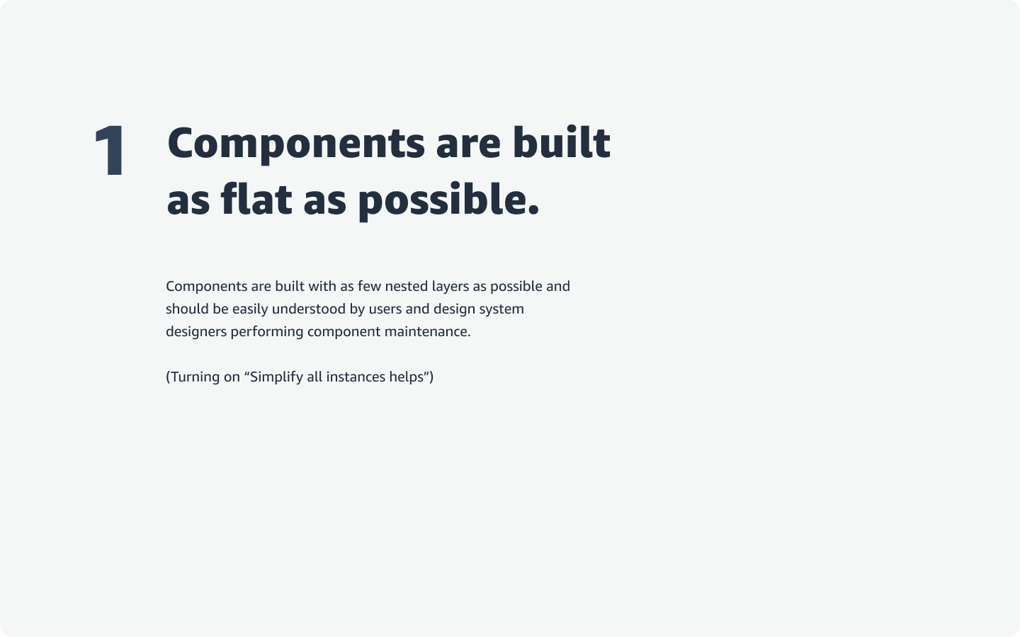

2.
Wrote a QA process for “Builders” and “Reviewers” with a supporting checklist component for designer’s artboards.
Theming and design tokens
It is a conventionally known fact that anything involving design tokens is challenging. Our team encountered plenty of limitations, hurdles, and challenges in this part of the project. For example:
Limitation: AppSec
An unanticipated limitation to the fundamental keystone of realizing our proposal for building a themable, multi-brand design system was what would happen if AppSec did not allow our team to use the Figma Token Studio plugin, the only solution for this scenario before Figma Variables. For months, our design system stakeholder had been tirelessly working behind the scenes to get AppSec approval to use the Token Studio plugin but to no avail, resulting in a substantial delay in investment into getting started on theming.
In the final months of the engagement, our design system stakeholder finally escalated our ticket high enough within AppSec that we were able to get started using a version of the plugin. This meant a hard piviot for me, from managing and authoring the component library to running as far and fast as possible on design tokens to set the team up for success before the project’s budget for consultants expired.
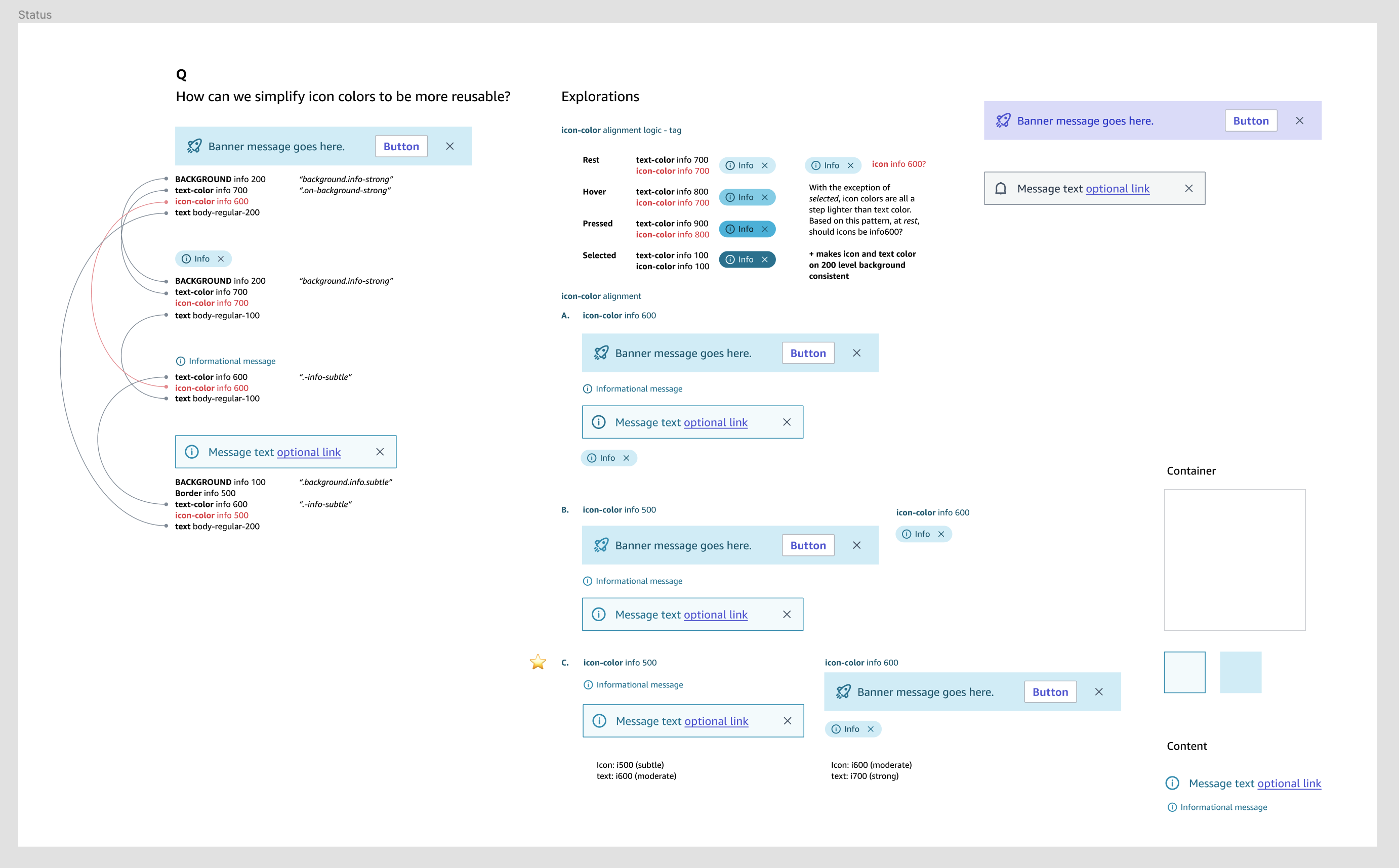
Once we started writing tokens, I discovered that for some component types where icons and text were together, each was slightly different in color; although intentional, they needed to be consistent. In my exploration, these inconsistencies could be addressed with a prominence scale to ensure that tokens remained reusable while keeping the components aligned with the original visual design.
Hurdle: A reluctent engineering team
One of the main hurdles we faced moving forward with theming initially was some differing thoughts on how theming could be accomplished by our engineering partners. However, the gap where non-developers could create new themes and see them in their design files remained. The good news is within a few meetings, the value of design tokens and my recommendation were ultimately accepted, unblocking the team and allowing us to move forward. (Except for a funny conversation I had with one of the devs who further validated my approach when he asked an AI for a token model, and it repeated back what I’d been saying the whole time.)
Challenge: Explaining tokens and theming to a non technical audience
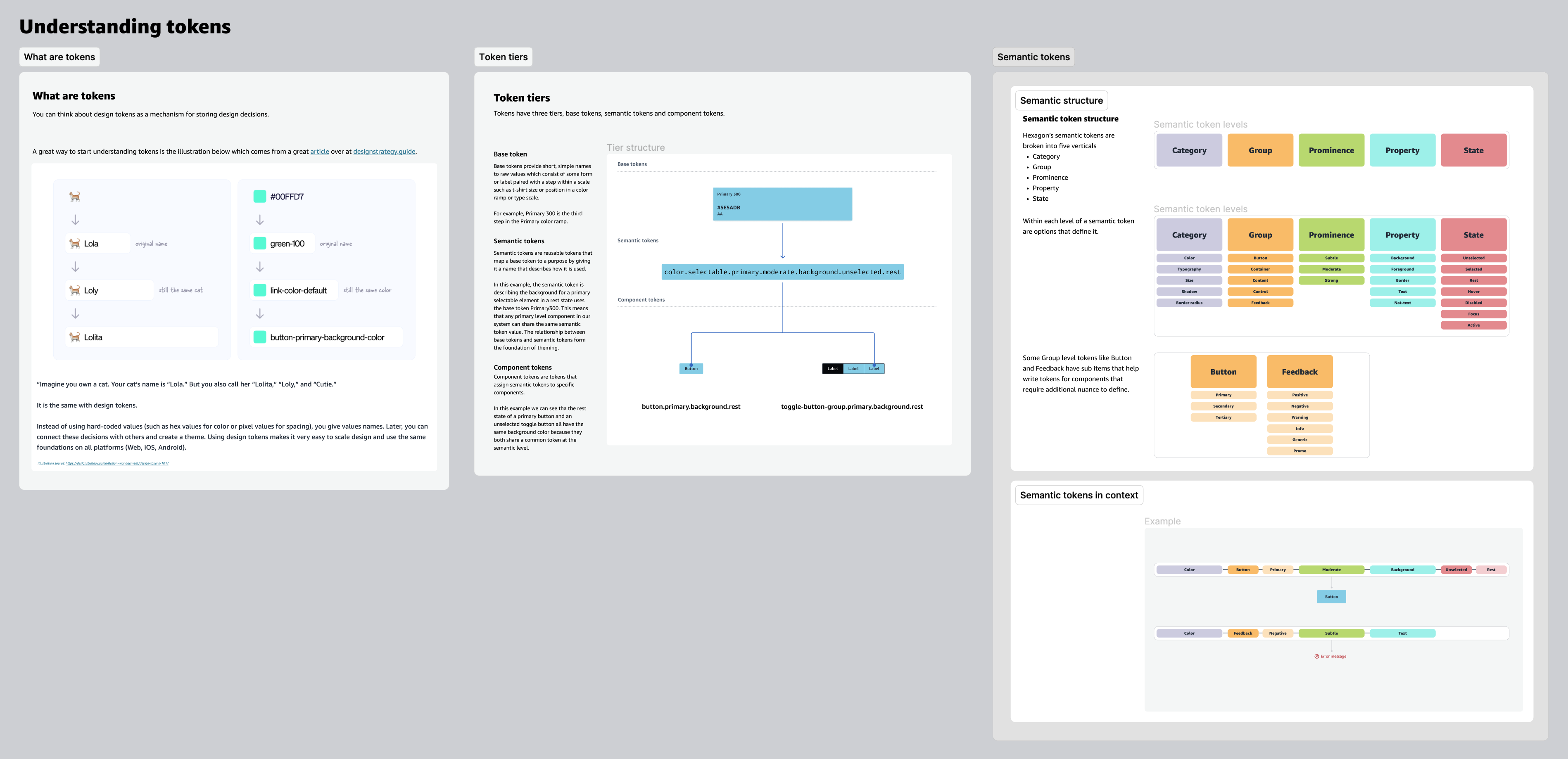
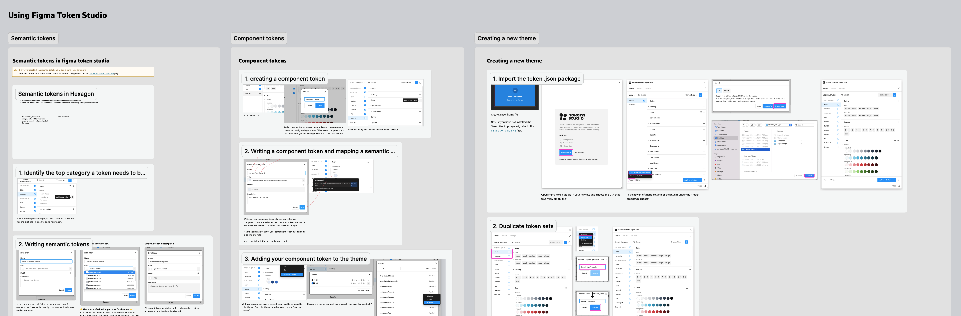
Part of the vision for theming was that any designer in the org could switch between branded product tokens and create a new theme and see it applied to their design. Token Studio, although powerful, has a pretty decent learning curve. This is not only in how it's built but also requires a baseline understanding of design token logic and structure.
![]()
With the consulting budget almost ending at this point, I taught the most senior of the client's system designers a crash course in design tokens, then shifted my focus once again, this time from writing tokens to documenting as many core concepts as I could to explain design tokens to non-developers and transition plan.
![]()
One of the main hurdles we faced moving forward with theming initially was some differing thoughts on how theming could be accomplished by our engineering partners. However, the gap where non-developers could create new themes and see them in their design files remained. The good news is within a few meetings, the value of design tokens and my recommendation were ultimately accepted, unblocking the team and allowing us to move forward. (Except for a funny conversation I had with one of the devs who further validated my approach when he asked an AI for a token model, and it repeated back what I’d been saying the whole time.)
Challenge: Explaining tokens and theming to a non technical audience
Part of the vision for theming was that any designer in the org could switch between branded product tokens and create a new theme and see it applied to their design. Token Studio, although powerful, has a pretty decent learning curve. This is not only in how it's built but also requires a baseline understanding of design token logic and structure.
With the consulting budget almost ending at this point, I taught the most senior of the client's system designers a crash course in design tokens, then shifted my focus once again, this time from writing tokens to documenting as many core concepts as I could to explain design tokens to non-developers and transition plan.
In conclusion
Takeaways
To say that I learned so much on this project is an understatement. Most of all, this project allowed me to improve my ability to build and scale collaborative processes, context switch, mentor designers across my team and larger org, and affirm that I love building design systems and am good at it.
To say that I learned so much on this project is an understatement. Most of all, this project allowed me to improve my ability to build and scale collaborative processes, context switch, mentor designers across my team and larger org, and affirm that I love building design systems and am good at it.
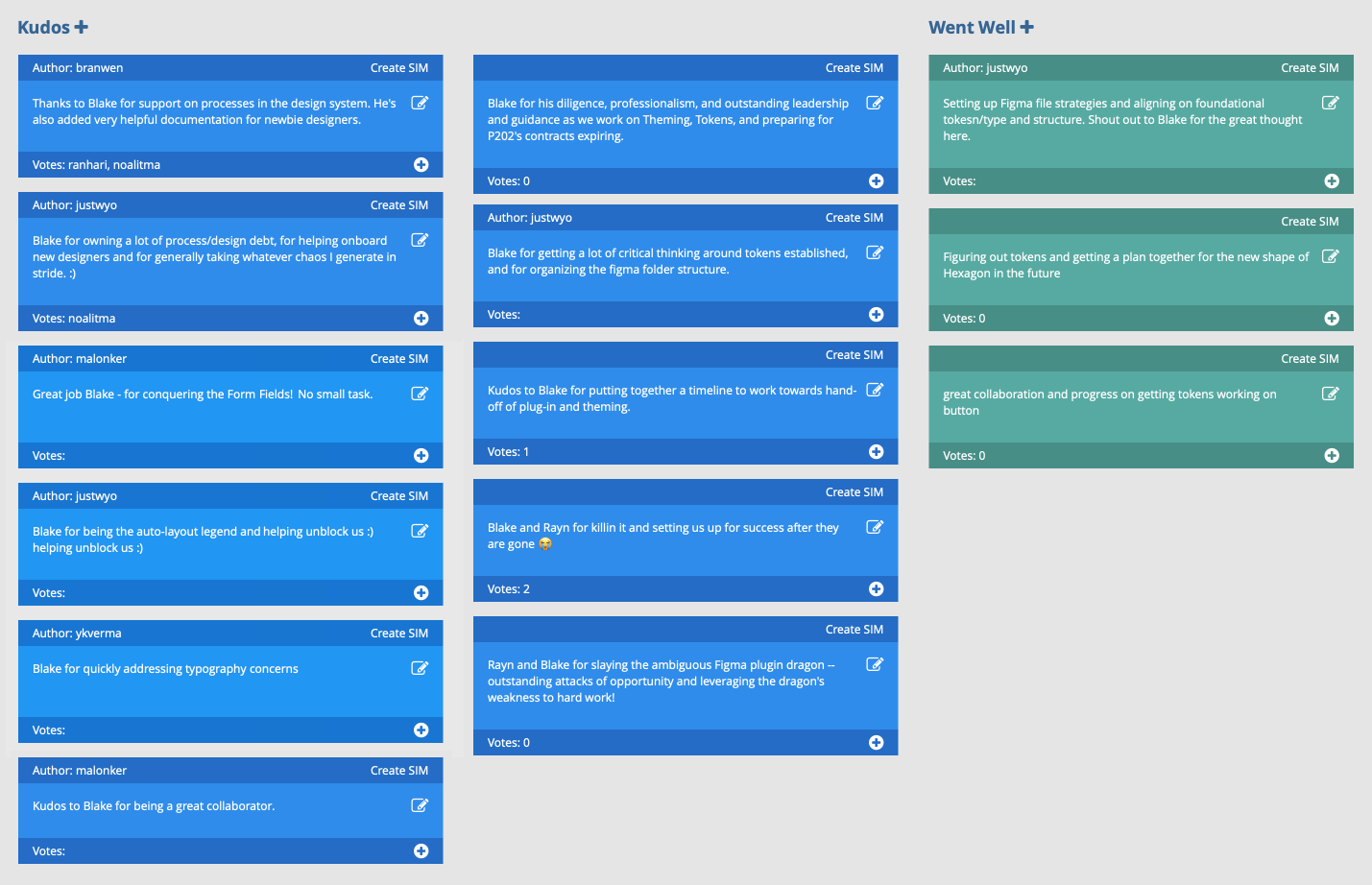
Kudos
At the begining of every new sprint, the the engineers, designers, and PM of the design systems team would meet together for a retro of the previous sprint. Here is a collection of some of the shoutouts I recieved over the course of the entire project.
At the begining of every new sprint, the the engineers, designers, and PM of the design systems team would meet together for a retro of the previous sprint. Here is a collection of some of the shoutouts I recieved over the course of the entire project.