Blake Wilton
Google Design Test, 2018 Creating an icon set to represent trains, spaceships, and time travel.
Google Design Test, 2018 Creating an icon set to represent trains, spaceships, and time travel.
Trains, Space and Time, an Icon Set for the Future of Travel
︎By mid-2018 the travel industry made tremendous breakthroughs in the efficiency and comfort of transglobal train travel, saw the formation of Earth’s first intergalactic travel agency whisking the people of earth off to relax among the stars in luxury orbital or surface habitats on distant planets. Or, for folks wishing for a trip full of adventure while staying a little closer to home, guests can travel through time itself to experience some of Earth’s most exciting eras firsthand without risk of inadvertently altering the future or the inconvenience of becoming trapped in a time paradox. The following documents how icons are created for this field.

The Grid
︎
The basis for this icon system is built on Google’s Material Design icon grid. After researching different icon grids I came to the conclusion that using the Google Material Design icon grid would provide the most flexibility for design while providing a solid framework for managing consistency across the icon set. The icons were designed on a 48x48px grid. At smaller sizes the monotone icons should be used.
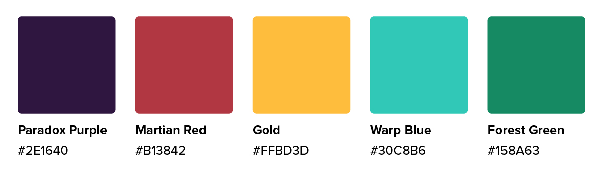
Colors
︎
The colors of the brand are meant to evoke the multi-faceted services of the travel industry of tomorrow across space, time and our green planet while capturing the energy of a bygone era built on the promise of space colonies, flying cars, jetpacks, and the spirit of limitless possibility.
︎
The colors of the brand are meant to evoke the multi-faceted services of the travel industry of tomorrow across space, time and our green planet while capturing the energy of a bygone era built on the promise of space colonies, flying cars, jetpacks, and the spirit of limitless possibility.
Icon design
︎
The design of icons for the Travel Agency should capture our mission of delivering a comfortable and memorable experience that’s fun, exciting and safe.
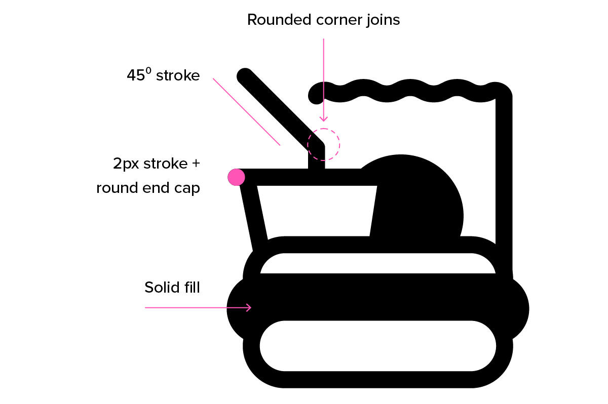
Anatomy of an icon
︎
These principals are reflected throughout the design with rounded corners, end caps and gently curving forms to make the icons more friendly. The design of the icons are formed with 2px strokes, rounded corner joins with selectively added fill areas to enhance the icon’s readability.
![]()
︎
The design of icons for the Travel Agency should capture our mission of delivering a comfortable and memorable experience that’s fun, exciting and safe.
Anatomy of an icon
︎
These principals are reflected throughout the design with rounded corners, end caps and gently curving forms to make the icons more friendly. The design of the icons are formed with 2px strokes, rounded corner joins with selectively added fill areas to enhance the icon’s readability.
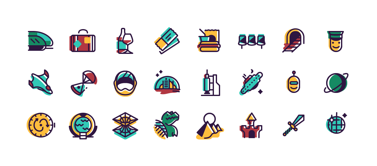
Monotone Icons
︎
︎

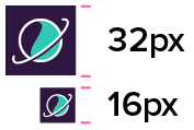
Favicon
︎
![]()
︎
Color Icons
︎
Stylistically with the colored versions of the icons, the fill colors are shifted ever so slightly outside of the shape to reference old printing techniques but also to enhance the motion and shape of an icon creating areas of whitespace that form highlights.
︎
Stylistically with the colored versions of the icons, the fill colors are shifted ever so slightly outside of the shape to reference old printing techniques but also to enhance the motion and shape of an icon creating areas of whitespace that form highlights.
Offsetting the Color and Exceptions
︎
Colors fills in this set are always shifted to the left creating a highlight on the right side of the icon. There are however some exceptions which based on the angle of the icon and movement. Here are some examples.
︎
Colors fills in this set are always shifted to the left creating a highlight on the right side of the icon. There are however some exceptions which based on the angle of the icon and movement. Here are some examples.


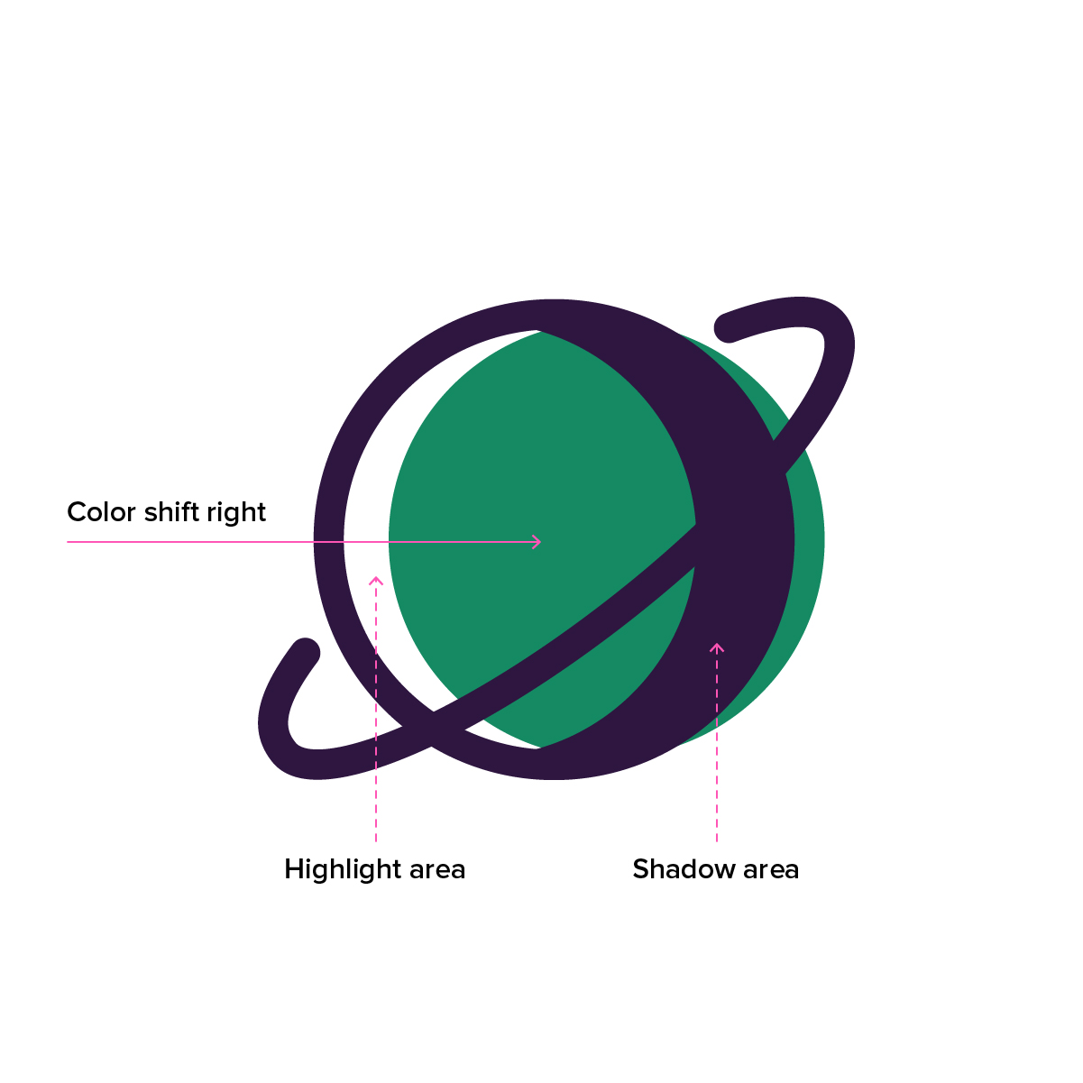
In the examples above, because some icon’s angle or position of a shadow the directional shift in the color fill is changed to enhance the shape or action of the icon. For the capsule with a parachute on the left, it’s color fill is shifted on the opposing axis of the icon to more clearly communicate the angle it is flying downward. In the middle, the helmet icon, the color fill is shifted downward creating a highlight below the opening of the helmet making it easier to read as a dimensional object. As another example, with the planet icon on the right, because the core shape has a built-in shadow area the fill is shifted to the right rather than left to create a left facing highlight which would otherwise have not appeared if the fill were moved to the left because of the existing shadow area.
When to use organic shapes
︎
There are some cases where an icon’s design contains a ground line. In these instances a color fill is more organic in shape to anchor the design.
︎
There are some cases where an icon’s design contains a ground line. In these instances a color fill is more organic in shape to anchor the design.
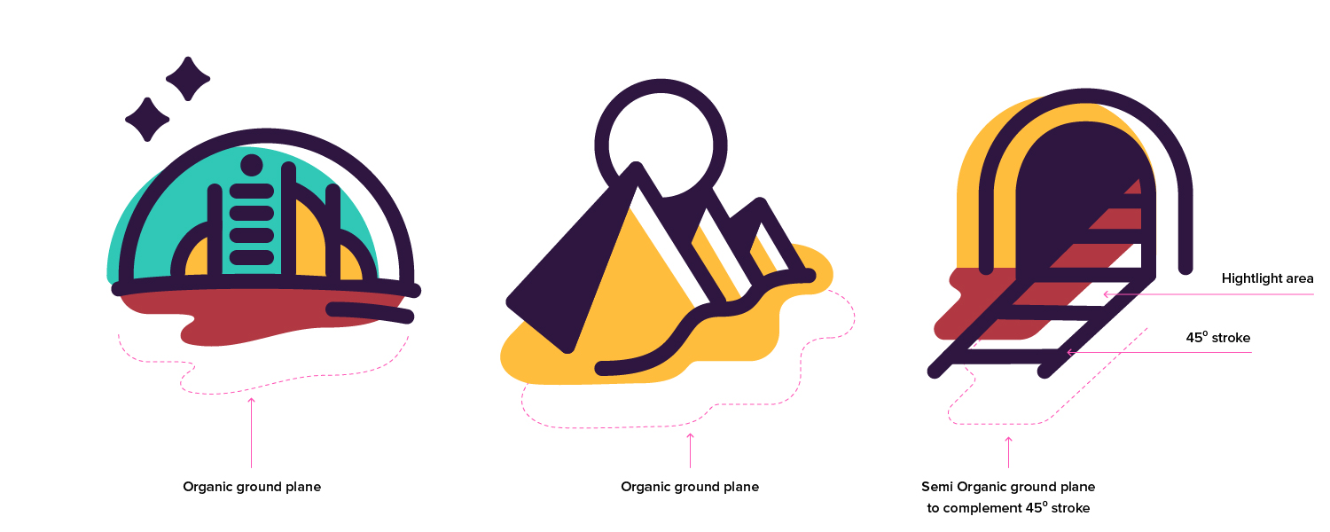
Organically shaped color fills are slightly larger than that of the active bottom edge of an icon to create a sense of depth. To create organically shaped color fills use a freehand vector drawing tool like Adobe Illustrator’s pencil tool to follow the icon grid to along the X-axis creating a horizontal area then stepping over along the Y-axis to create a curve into another parallel creating a shape with a wavy edge. Refine as needed to polish the icon’s design. In the case of the tunnel icon to the right, the color fill area is shifted to the left as other color fills however in this case additional fill area is added to meet the edge of the shifted yellow fill enhancing its sense of depth.
Process
︎
I first began my process by assembling inspiration and researching icon design best practices as a little refresher. From here started sketching travel concepts relating to the subject matter of train, space and time travel to help frame my focus.
![]()
Following this exercise, I brought my sketches into my computer where I began experimenting with how to take my rough sketches and refine them into refined shapes based on the icon grid I used as a foundation.
︎
︎
I first began my process by assembling inspiration and researching icon design best practices as a little refresher. From here started sketching travel concepts relating to the subject matter of train, space and time travel to help frame my focus.
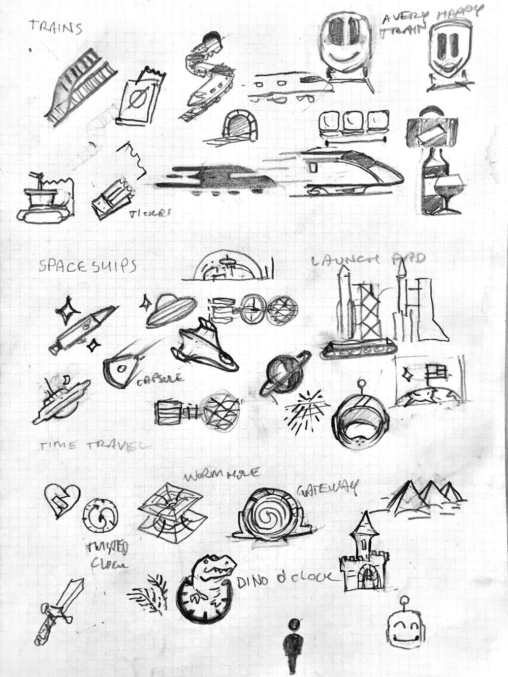
Following this exercise, I brought my sketches into my computer where I began experimenting with how to take my rough sketches and refine them into refined shapes based on the icon grid I used as a foundation.
︎