Cava Website Redesign
UX/UI, Visual Design
Project Background︎
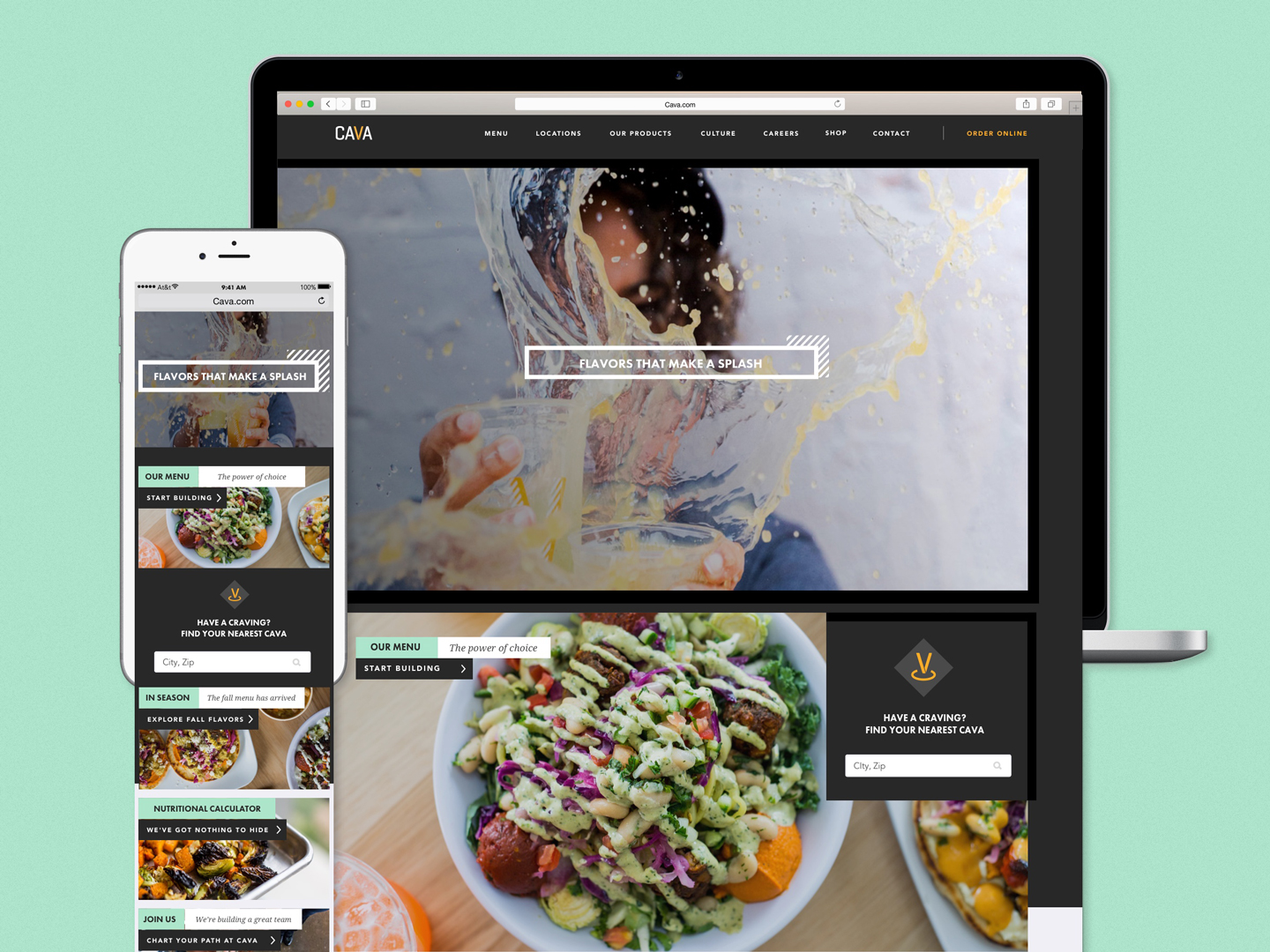
In early 2017 the Cava brand team and I began the process of redesigning Cava’s website. As Cava’s only digital designer at the time my responsibilities included creating the new user experience, visual design and presenting my concepts and progress to stakeholders.This was a tremendous undertaking but an incredible opportunity to help shape the future of the brand and how to create an experience that puts customers first.
In early 2017 the Cava brand team and I began the process of redesigning Cava’s website. As Cava’s only digital designer at the time my responsibilities included creating the new user experience, visual design and presenting my concepts and progress to stakeholders.This was a tremendous undertaking but an incredible opportunity to help shape the future of the brand and how to create an experience that puts customers first.
The Main Navigation
︎
Designing the main navigation for the new Cava site was a unique challenge. One of those challenges was navigating an ever-evolving list of content requirements that added a new menu item every few weeks or so. The second challenge was how can I design a mobile navigation without using the word “Menu” as that is already one of the navigation options and a significant one at that. I knew I did not want to use a hamburger nav as research shows they perform incredibly poorly with users. Where I landed was something akin to hamburger navigation but styled in a way that suggests the movement of the menu overlay from the bottom of the screen with the menu navigation items ordered in order of importance from bottom to top to optimize for easy access on larger devices.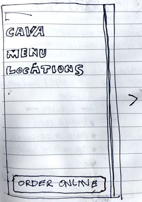 One of my ideas for accommodating the large amount of menu items was to have the mobile menu slide out from the side while having an easily accessible button for online orders.
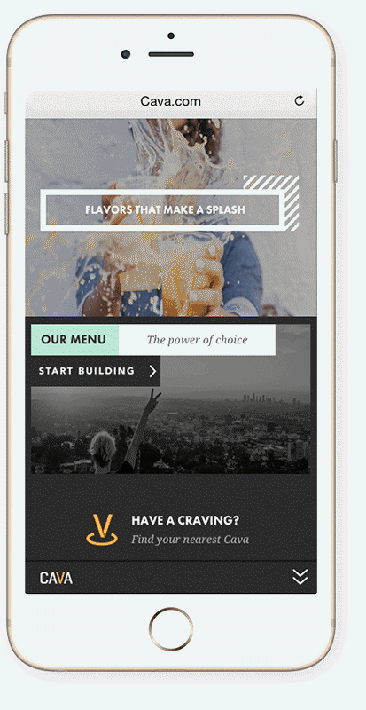
Mobile navigation design that reorders the menu items from left to right to top to bottom in order of importance to the user.
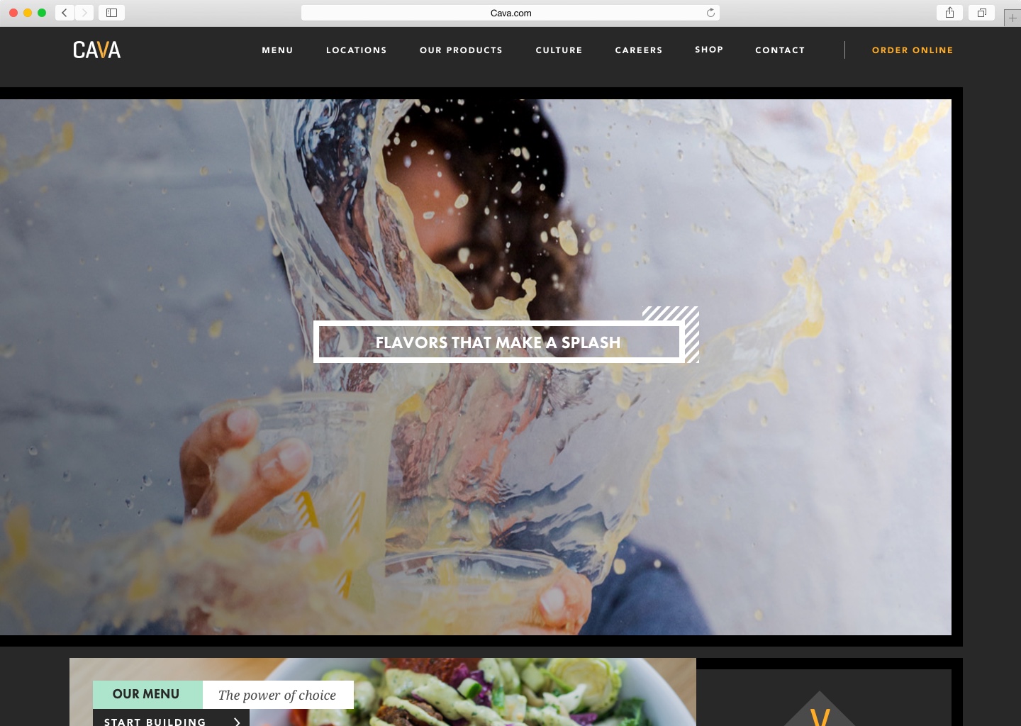 A goal for the main navigation was to create something clean and user friendly. The original version of the site used white text without a background which made it very hard to read in many places on the site. Putting the main navigation on a solid background was something I knew I wanted to do very early on in the project.
Building a Better Menu Page
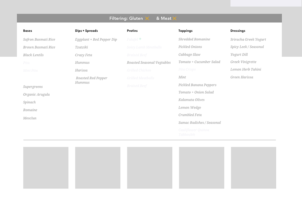
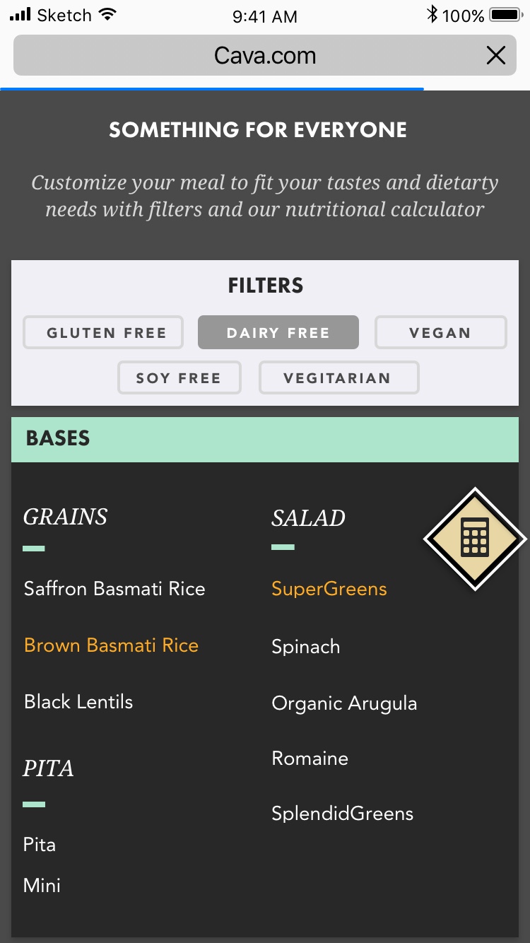
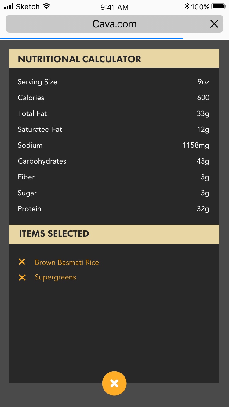
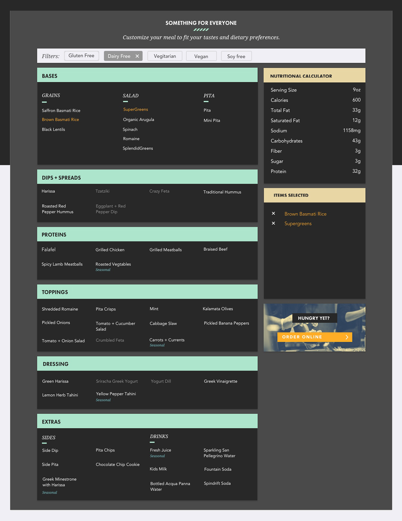
︎Cava is a restaurant company, so the menu page is one of the most important on the site. Based on customer feedback we knew that the previous design was overwhelming and with all it’s, allergen, nutritional, and sourcing information spread across multiple static subpages it was confusing as well. My vision for this page was making the menu more approachable and combining all the dietary and nutritional data into a single interactive tool that would allow a customer to dynamically filter the menu based on their individual needs while creating an experience a customer would have in one of Cava’s restaurants.


Sketching and Prototyping the Menu
︎
After learning more about customer pain-points with the existing design that I learned from the Customer Experience team, I started sketching ways this tool could work. Initially, my idea was to make the design conversational through text inputs. The challenge here is that it might be challenging to communicate what a customer was supposed to do, so I shifted my design to a tag-based filtering system to take some of the guesswork out for customers by making all the filtering options visible to customers at the same time. The benefit of this approach is that additional tags could be added to filter the menu in new ways such as adding tags for trendy diets like Paleo or Whole Thirty.
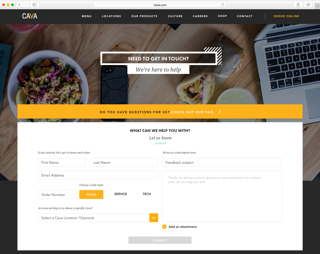
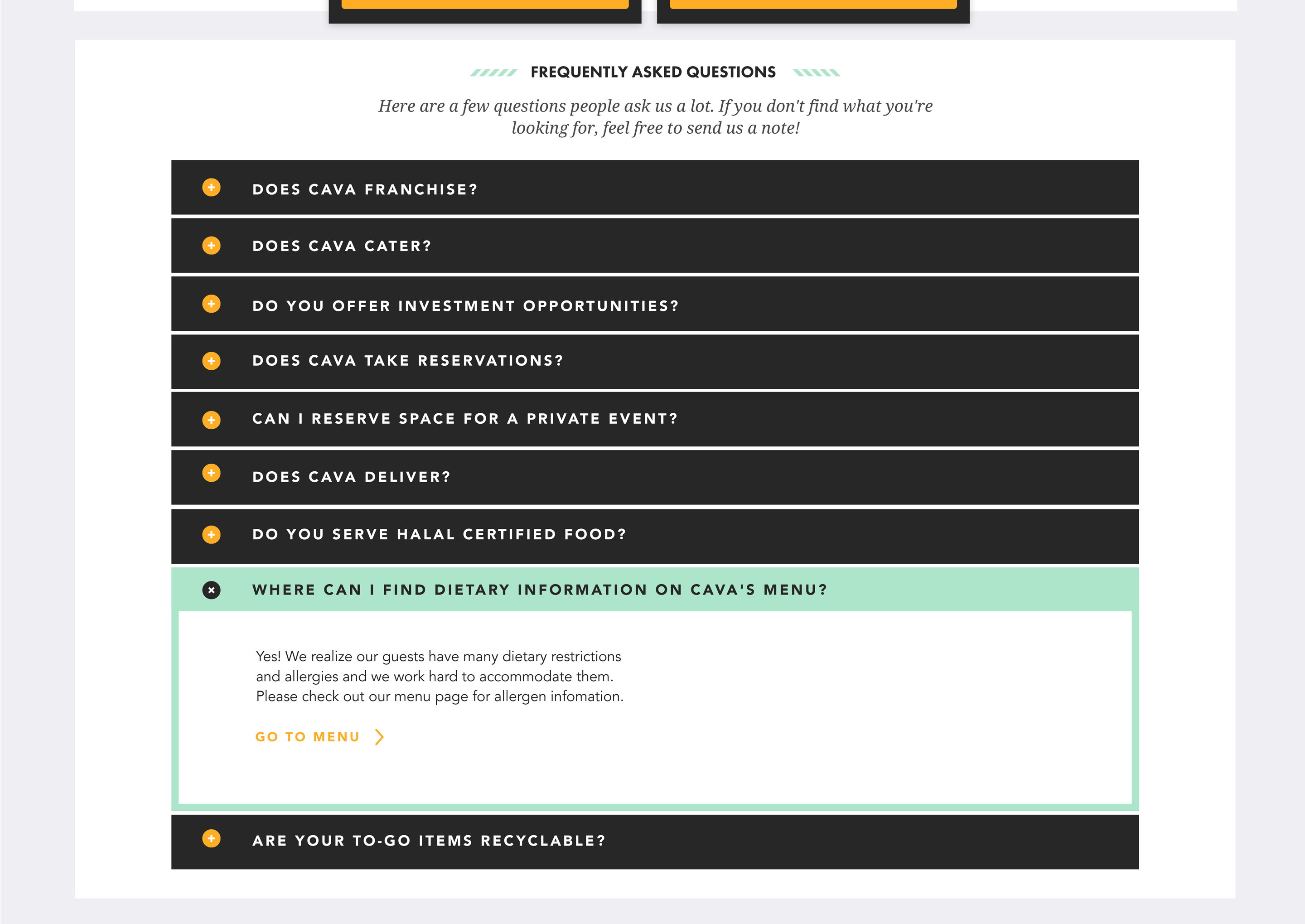
The Contact Page
︎Collaborating with the Customer Experience team, the key goals we set for the contact page was to reduce the volume of commonly submitted customer questions by encouraging customers to self-help via an overhauled FAQ section without adding friction for customers who need to talk to that team.

Background
︎
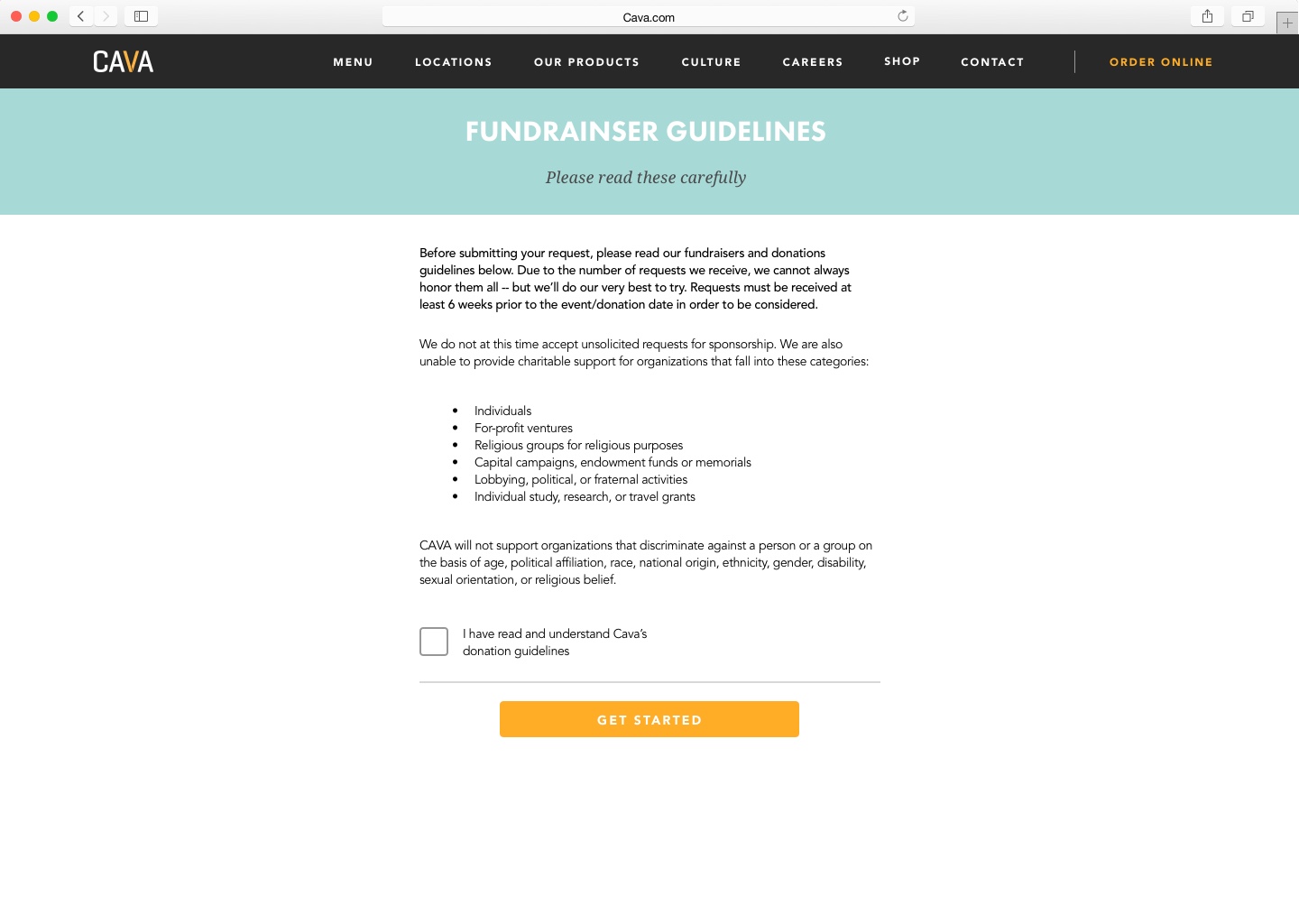
A big part of the Cava culture is giving back to the community. One of the ways way Cava does this is through a profit-sharing program where customers can host a fundraiser at a Cava store for a set amount of time, after which, Cava donates a percentage of the store’s profits to the customer’s organization or cause.
︎
A big part of the Cava culture is giving back to the community. One of the ways way Cava does this is through a profit-sharing program where customers can host a fundraiser at a Cava store for a set amount of time, after which, Cava donates a percentage of the store’s profits to the customer’s organization or cause.
Food as a Force for Good
︎
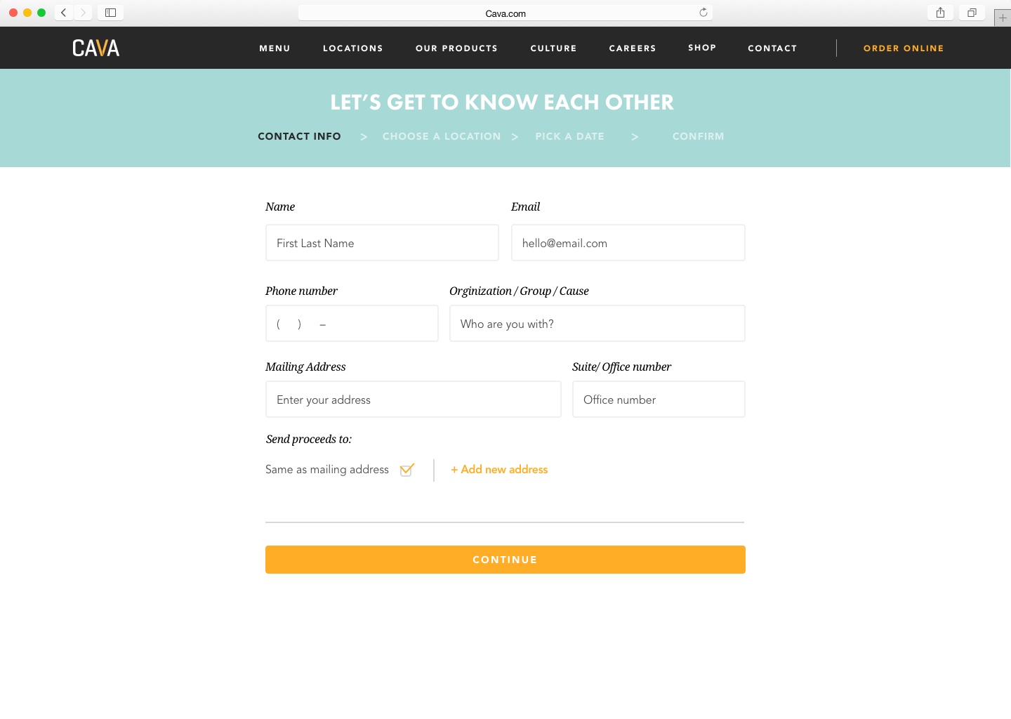
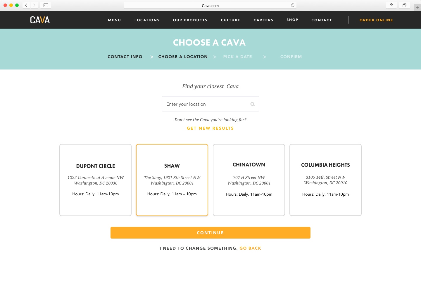
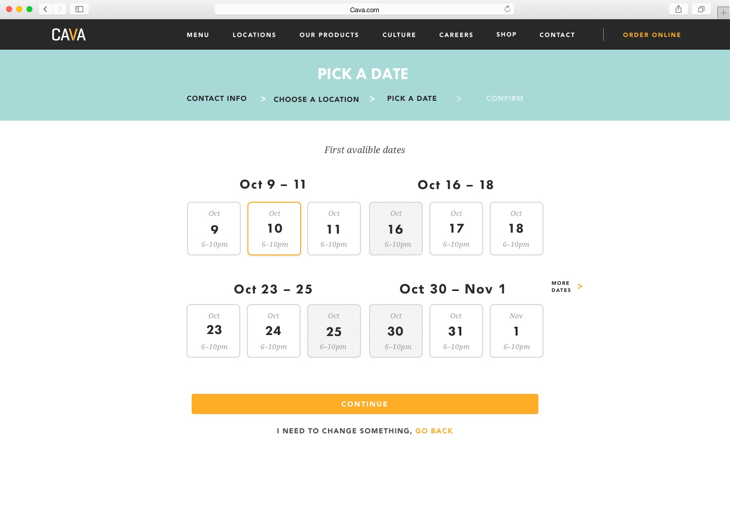
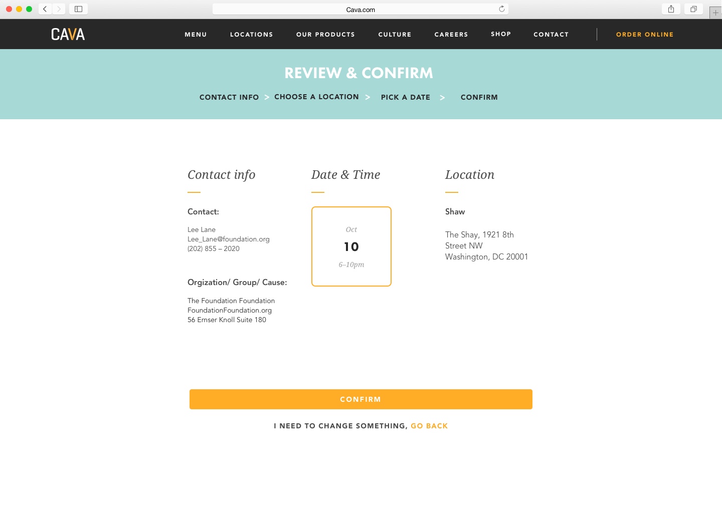
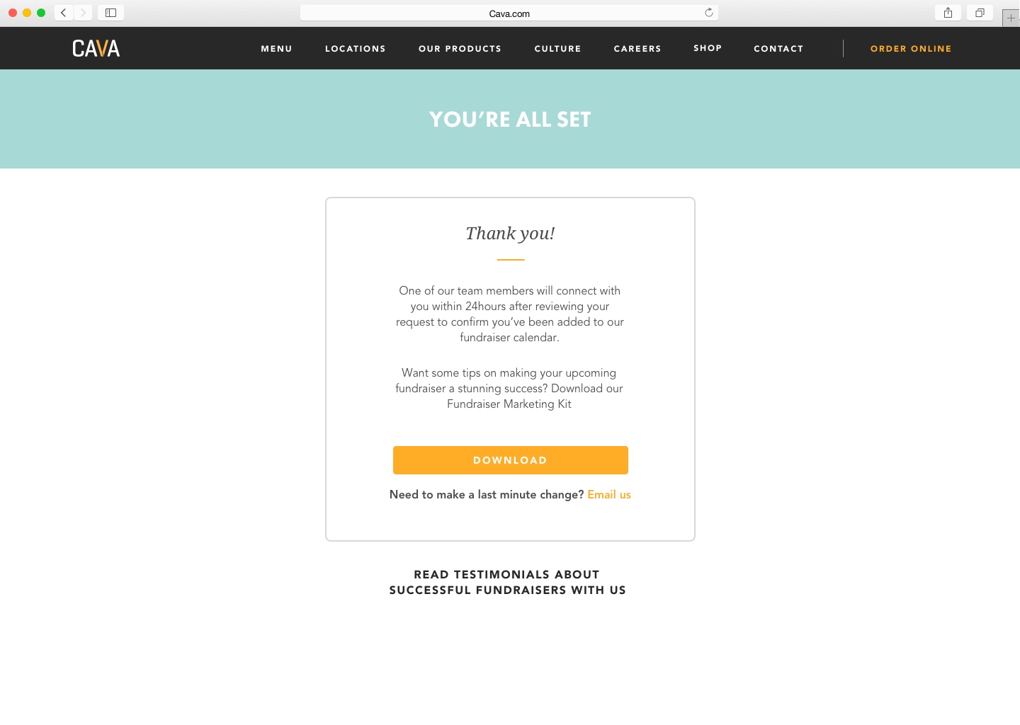
To kick off this part of the redesign first thing I needed to do was understand how fundraisers are setting up at a Cava location. What I learned was that it’s a really labor and time intensive process for both customers and the customer experience team requiring a lot of emailing back and forth. The solution I worked up was to design a web app that walks customers through the reservation process step by step. 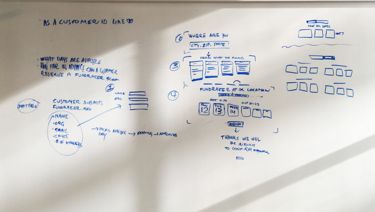 Process
︎
To understand how this process works from the Customer Experience team’s perspective I led a white-boarding session where all the pieces of information collected from customers for a fundraiser were mapped and then grouped to create steps a customer would take in the new design. From here I made a prototype that I tested with everyone on the Customer Experience team to collect input and to make sure that the prototype was going to meet their needs as well as those of our customers as well as those of our customers while emphasizing ease of use and clarity of information.